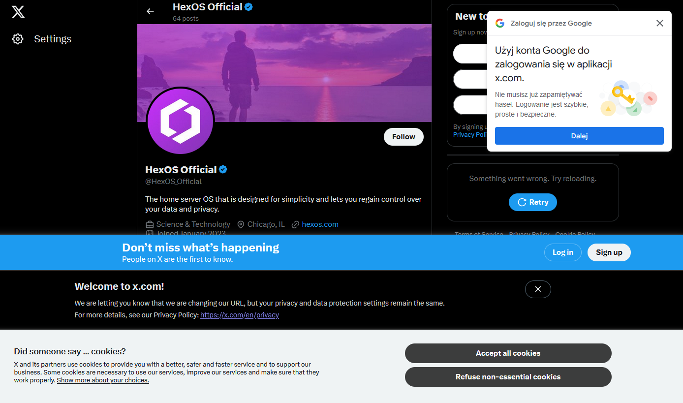
The corporates keep finding ways to reintroduce the same shitty popup ads from the 90s to defeat whatever's been put in place to keep it from happening. Absolutely no sense of nuance. It's not the specific delivery mechanism users dislike, it's the whole terrible UX pattern. Stop trying to make me do shit that's not what I'm trying to do!
Technology
This is a most excellent place for technology news and articles.
Our Rules
- Follow the lemmy.world rules.
- Only tech related content.
- Be excellent to each another!
- Mod approved content bots can post up to 10 articles per day.
- Threads asking for personal tech support may be deleted.
- Politics threads may be removed.
- No memes allowed as posts, OK to post as comments.
- Only approved bots from the list below, to ask if your bot can be added please contact us.
- Check for duplicates before posting, duplicates may be removed
Approved Bots
X gon give it to ya
Gemini is an attempt at trying to bring the old web back, although with some technical limitations.
I heavily disagree with this. Stepping back to "walls of text with hyperlinks" is a bad idea that'll service no one and will never succeed in any reasonable capacity.
Current web technology is not what caused bad web. The exception would be too powerful js where js should only provide interactivity and extra flavor to the page rather than run a full application which can fingerprint and punish user agents.
Javascript, embeded images and audio are awesome things that can improve content readability a thousand fold. Just look at best docs on the web - all of them use these features to tend their users. Even wikipedia added js flavoring like hover pop ups. Because it works.
While the web is looked at as a superstore rather than a library, function will dictate form.
This is the digital equivalent of walking through an open air market and having salespeople harass and follow you trying to sell something
Never thought I'd miss frames. Though really, I always wondered exactly why they got dogpiled into nonexistence. Formatting issues?
Security nightmare as well
Hahaha I had the exact same reaction and made an almost identical screenshot of this eyecancer…
Why are you all on X/Twitter? It's utter trash, I just avoid the whole thing.
I’m not on Twitter, or any social platform, but sometimes a link leads met to a post or an account. Et voilà!
I set 2 different people up with revanced over the weekend. I thought I'd typed in the wrong URL because I'm on Firefox mobile and both of them are on Chrome mobile. Literally looks like an entirely different site. On Chrome it's got a big fancy logo at the top, ads....fucking....everywhere...
On Firefox(with various blockers and anti trackers etc etc) it's a plain white page with a bold title and small blurb then links to the various apks. Took me a minute to even figure out where the link for the manager was.....
Just gotta love what Elon did with the place. Not that it was great before, but now it looks and feels like a seedy Thai hooker palace
Google and YouTube are pretty fucking bad without an ad-blocker installed. From someone who has worked in jobs where I may as well have called myself a 'Professional Googler' and where I do not have permissions to install an ad-blocker on my work computer, the amount of ads I get buried with really sours the experience.
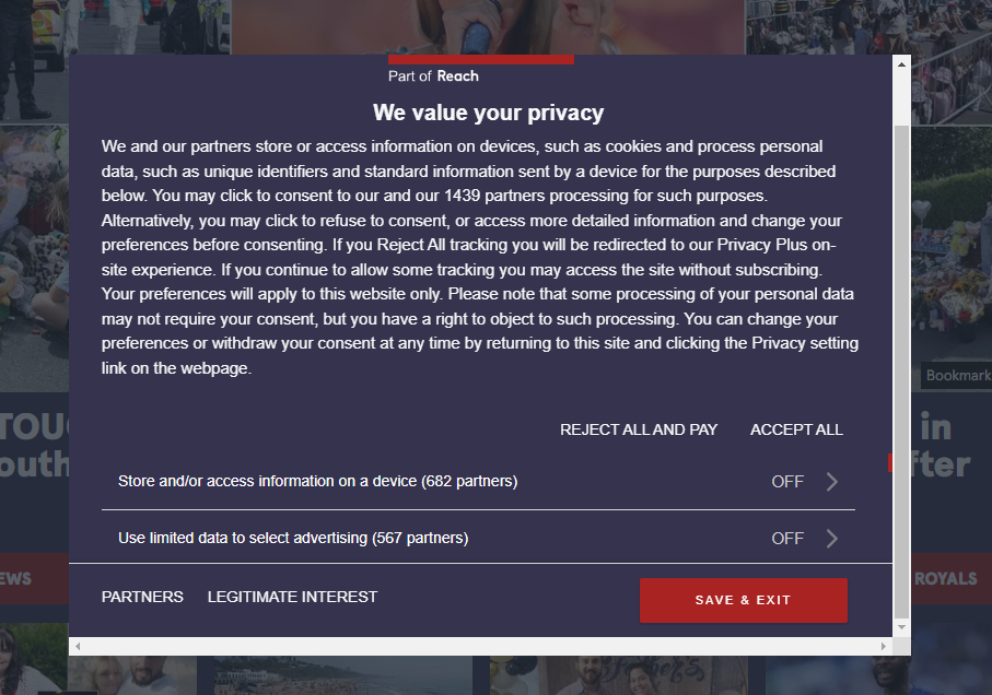
Also, a lot of news sites (particularly anything owned by Reach PLC such as the Mirror) are now flipping the middle-finger at GDPR by forcing users to pay to reject tracking cookies. Here's a screengrab from the Daily Mirror website...

I just set all the twitter and meta domains to localhost in my hosts file; no accidental clicks that go through for me :)
I've become quite picky about what sites I visit because of this, and it's why I don't like opening links. I know you can block this crap, but it's seldom worth the effort.
