this post was submitted on 30 Oct 2024
546 points (92.8% liked)
Technology
59377 readers
3846 users here now
This is a most excellent place for technology news and articles.
Our Rules
- Follow the lemmy.world rules.
- Only tech related content.
- Be excellent to each another!
- Mod approved content bots can post up to 10 articles per day.
- Threads asking for personal tech support may be deleted.
- Politics threads may be removed.
- No memes allowed as posts, OK to post as comments.
- Only approved bots from the list below, to ask if your bot can be added please contact us.
- Check for duplicates before posting, duplicates may be removed
Approved Bots
founded 1 year ago
MODERATORS
you are viewing a single comment's thread
view the rest of the comments
view the rest of the comments

~~What the hell are you talking about? I push the power button every single day on my PC. I'm aware that wake on LAN is a thing, but your average computer user doesn't utilize that feature. And only a psychopath who doesn't care about their power bill nor the environment would leave their PC running 24/7.~~
Edit: Thanks for the insight. You were right, I was wrong. My bad.
The power draw of these things when sleeping is negligible. They’re basically off, so there’s no real need to shut them down with any regularity.
I can use my MacBook for a whole day and still have half the battery left. Their power efficiency is genuinely remarkable.
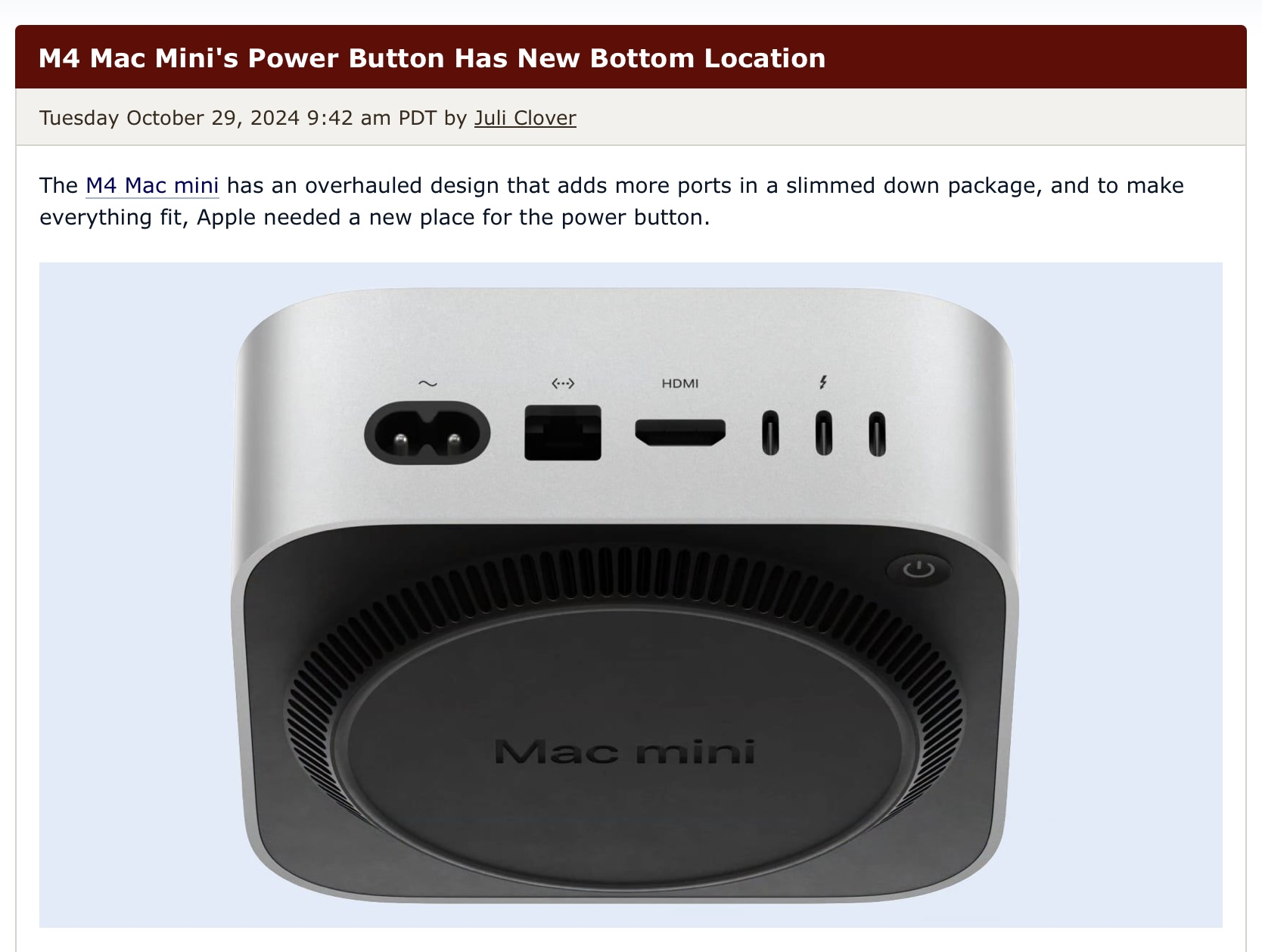
This is correct, but still, fuck apple. What if I just prefer to turn my computer off instead of putting it into sleep mode? And how exactly am I supposed to wake up my computer from sleep if the power button is inaccessible? I know macs can be configured to wake up on keyboard/mouse activity, but that makes them too easy to wake up on accident.
It would be annoying, but to be fair, it's the Mac Mini, which is small and easy to pick up. I would guess you could just tip the corner up to press the button.
I still think it's a dumb design. It's going to confuse everyday users
Call me a conspiracy theorist, but I believe this is the intention. I think big companies deliberately put in confusing and bad design to "test the waters" and see if people will still buy their products. It's the same with the apple mouse charging on the bottom, or why companies keep making their logos uglier with each iteration. It's a psy-op to condition the masses into accepting worse products without complaining.