this post was submitted on 25 Oct 2023
333 points (95.1% liked)
Climate - truthful information about climate, related activism and politics.
5239 readers
375 users here now
Discussion of climate, how it is changing, activism around that, the politics, and the energy systems change we need in order to stabilize things.
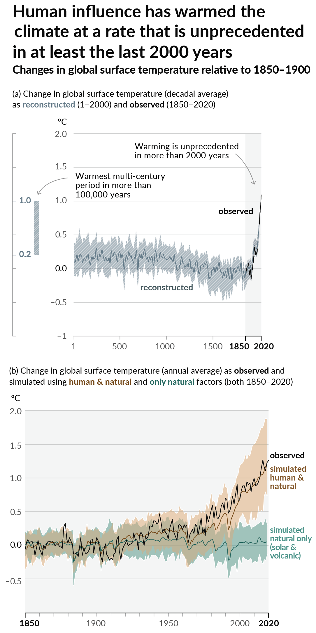
As a starting point, the burning of fossil fuels, and to a lesser extent deforestation and release of methane are responsible for the warming in recent decades:

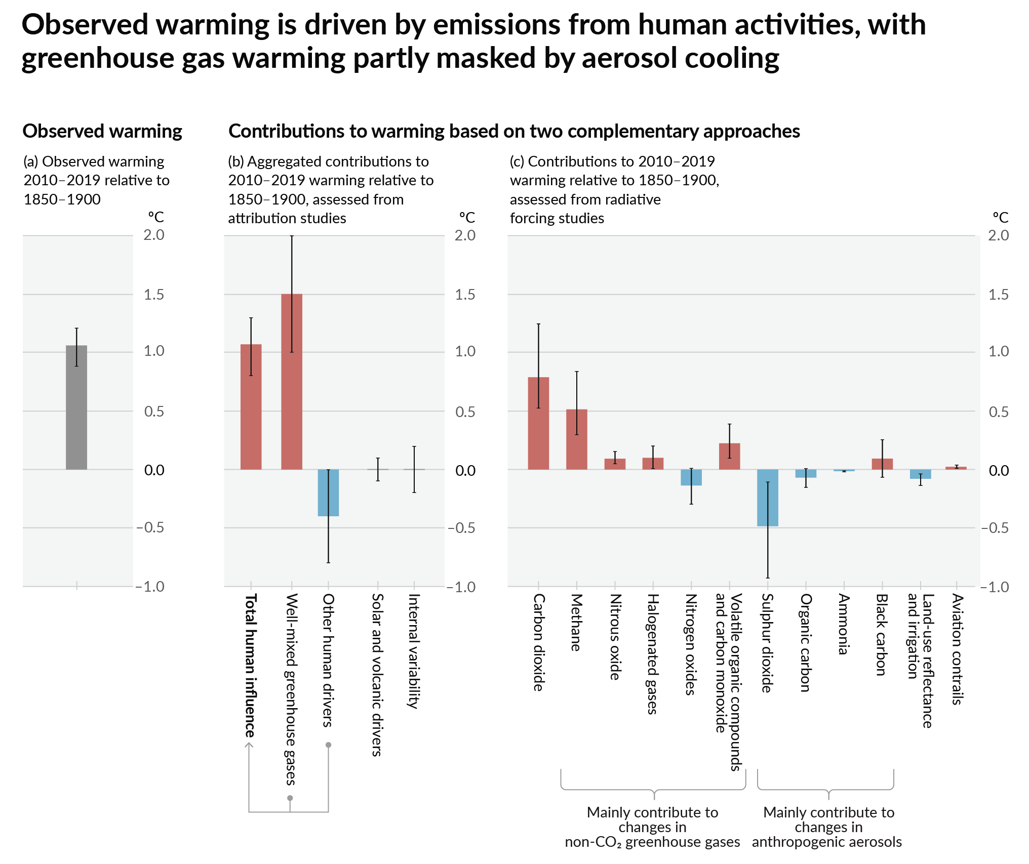
How much each change to the atmosphere has warmed the world:

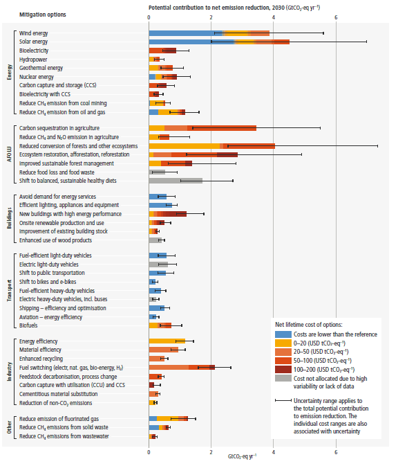
Recommended actions to cut greenhouse gas emissions in the near future:

Anti-science, inactivism, and unsupported conspiracy theories are not ok here.
founded 1 year ago
MODERATORS
you are viewing a single comment's thread
view the rest of the comments
view the rest of the comments

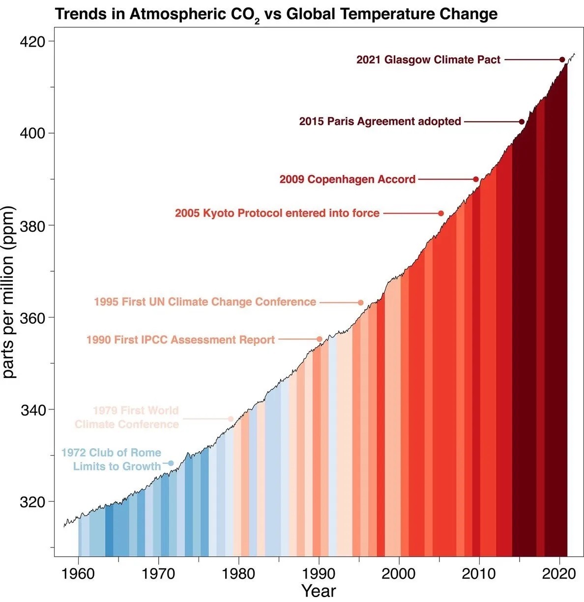
Wheres the scale for temperture change, yeah the colors indicate a trend from cold to warm but how warm isnt shown
this wasn't my exact complaint, but it's similar; the graph starts at 320 and goes up to 420, meaning the slope is intentionally exaggerated. if you want to show us how much worse things have become, give us comparison to earlier CO2 levels, otherwise this just gets dismissed as alarmist propaganda.
The slope isn't exaggerated at all, the increments are same as if you showed the full graph from zero. But zero isn't a useful baseline, and zooming out to fit it into your screen would give a false impression of a flat change at the top of a narrow section of history. What would fix that is a longer x-axis showing further back in time. Then you'd see a relatively flat line with some rises and dips, then at the end a sudden spike.