this post was submitted on 28 Mar 2024
816 points (97.9% liked)
xkcd
16260 readers
13 users here now
A community for a webcomic of romance, sarcasm, math, and language.
founded 2 years ago
MODERATORS
you are viewing a single comment's thread
view the rest of the comments
view the rest of the comments

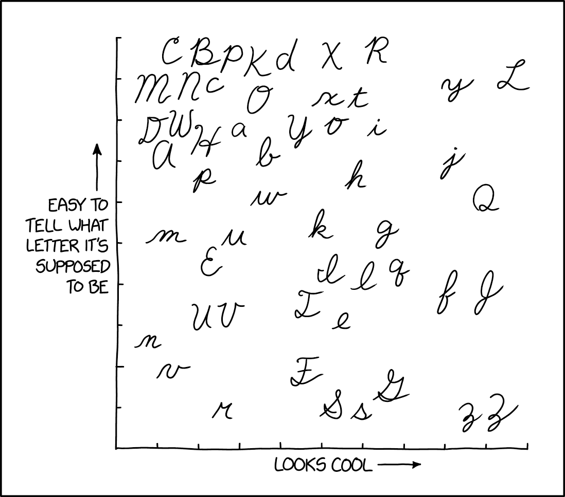
Lowercase m, n, u, v, and w are confusing as shit when placed next to or near each other.
Try Cyrillic cursive.
So Donald Trump has been signing his name in Russian this whole time? It all makes sense now!
Good god.
I remember coming across a similar comment chain, and someone brought out cursive Hanzi, and everyone lost their minds.
I am going to show this to my Chinese teacher to see if it's in any way legible. Because honestly, I can't see that being readable by anybody.
this feels like a shitpost and i wont fully believe it until - i dunno when.
No, that's true. However, putting lines under e.g. the ш makes it a bit more readable.
Can ia solve this problem?
Cyrilic cursive uses dashes in the same way Latin uses dots. Try writing "minimum' without them, and you'll get the same results.
This is the first I'm hearing about dashes. What do you mean?
You know how и and п have the same shape, but п has a dash on top? You can put the dash on the bottom to easily differentiate и and ш from м and л.
Especially when people are writing 'garlands'.
Vacuum is another good one, or anniversary.
You got me writing 'vacuum' and 'anniversary' in cursive, and got so conscious about how I write it that my speed crawled to a stop and my handwriting got even worse than what I started with, lol!
In casual writing, I separate out
v,wand other letters that are trickier to write in full cursive. Same goes witht,i,jso that I can do the crosses and dots before moving on.All those seems to have done the job of making my cursive a bit easier to read. All hell breaks loose when I need to write really fast though.
EDIT: stupid formatting, lol!
Irreverence.
I tried writing them so that I can post this. I might have failed in making them both cursive and legible, lol!
That very last line is my attempt at writing at speed. 😅
Man, this must be what it feels like to be a teacher, all the time. It's cool though, much better than I can manage.
Lol~ Thanks.
I grew up at a time when cursive is a requirement--not just for one class, but for all classes in primary school. I remember our teachers checking our notebooks and making comments on our handwriting. All our compositions and essays were required to be in cursive, and they check for penmanship, keeping margins and all that. It was a whole lot of effort for something that I rarely get to use in higher levels. I switched to print in HS, when cursive is no longer required.
I didn't mean the word, but the way some people write the letters 'm' and 'n' with the bows downwards, so that the look really similar to 'w' and 'u'.
Oh, yeah! Sometimes context helps, but if you can't even read a single word, you're just out of luck!