this post was submitted on 23 May 2024
196 points (97.6% liked)
British Columbia
1826 readers
14 users here now
!britishcolumbia@lemmy.ca
News, highlights and more relating to this great province!
founded 4 years ago
MODERATORS
you are viewing a single comment's thread
view the rest of the comments
view the rest of the comments

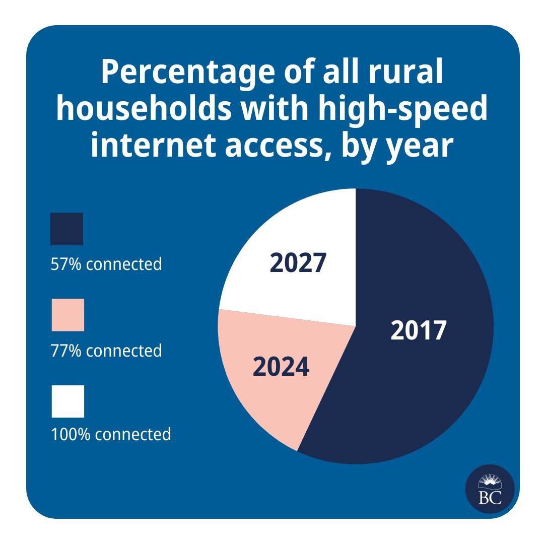
It's not valid. Peach is labeled 77% but occupies 20% of the pie.
This chart with these labels is definitely invalid. The dataset it's based on is coherent, but the labeled pie chart is invalid
Yeah, could show adding the colored blocks together like (color1) + (color2) = 77% connected
“🟦 ➕ 🟧 = 77%”