this post was submitted on 07 Oct 2024
207 points (98.6% liked)
Climate - truthful information about climate, related activism and politics.
5240 readers
683 users here now
Discussion of climate, how it is changing, activism around that, the politics, and the energy systems change we need in order to stabilize things.
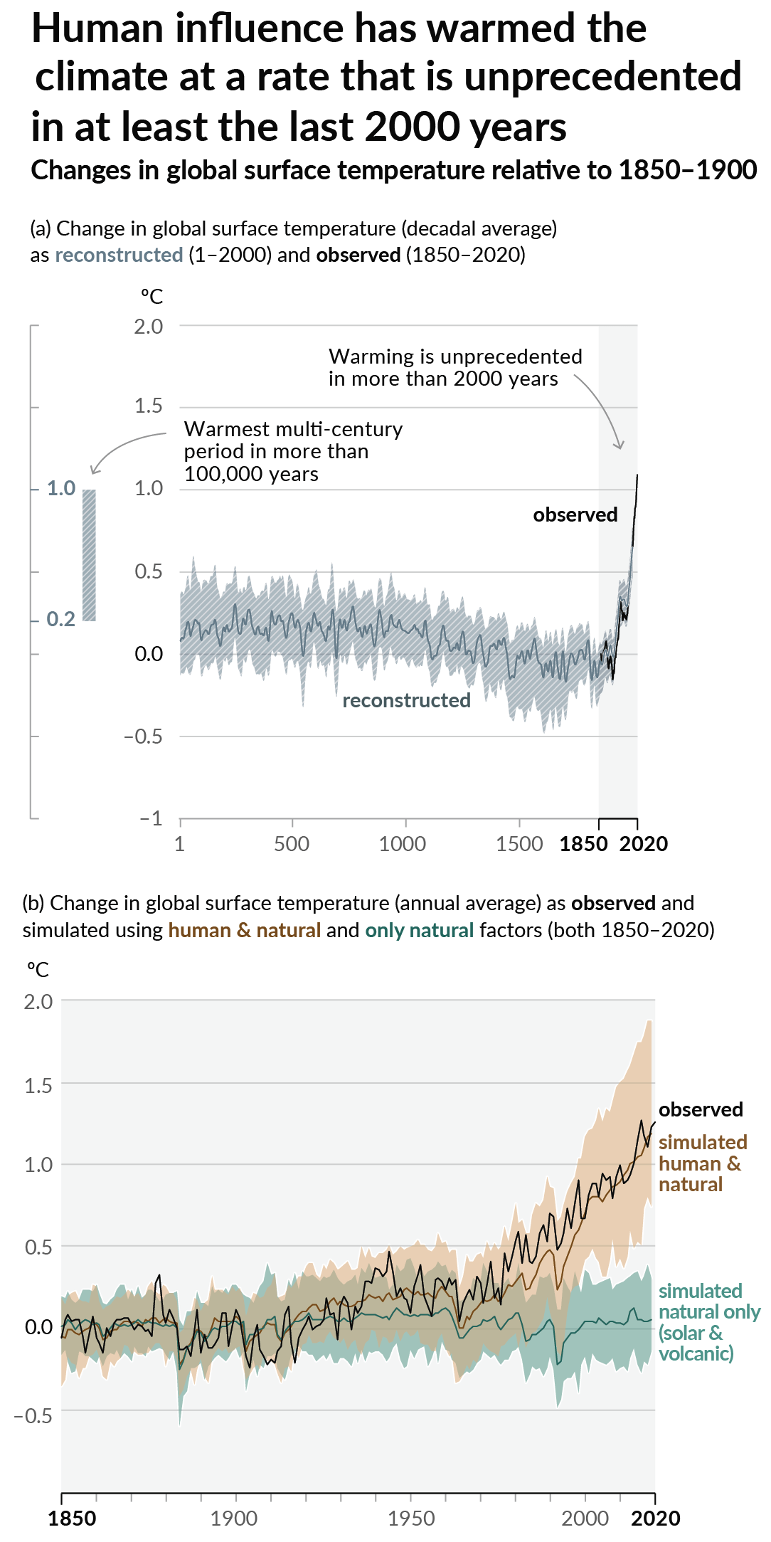
As a starting point, the burning of fossil fuels, and to a lesser extent deforestation and release of methane are responsible for the warming in recent decades:

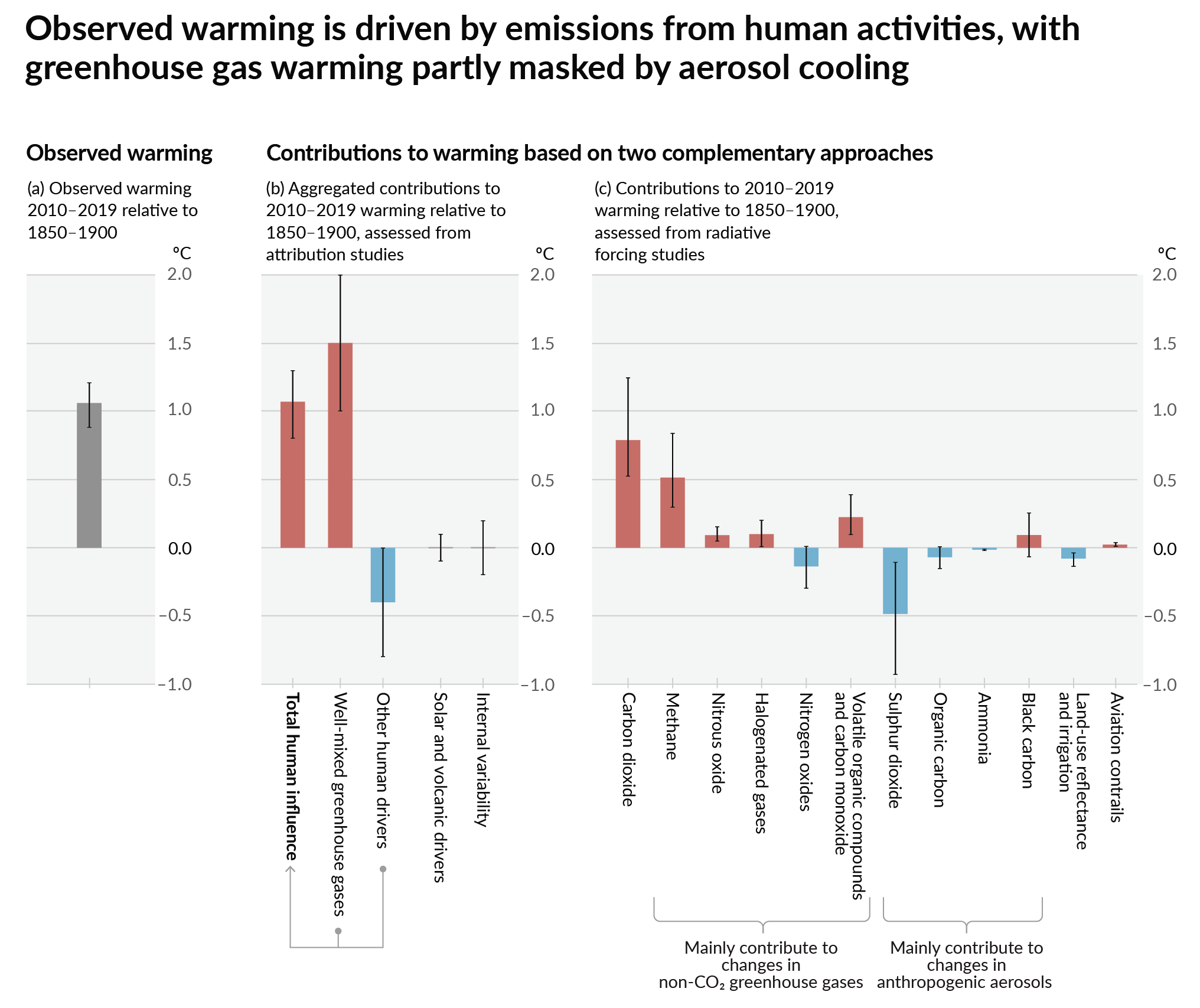
How much each change to the atmosphere has warmed the world:

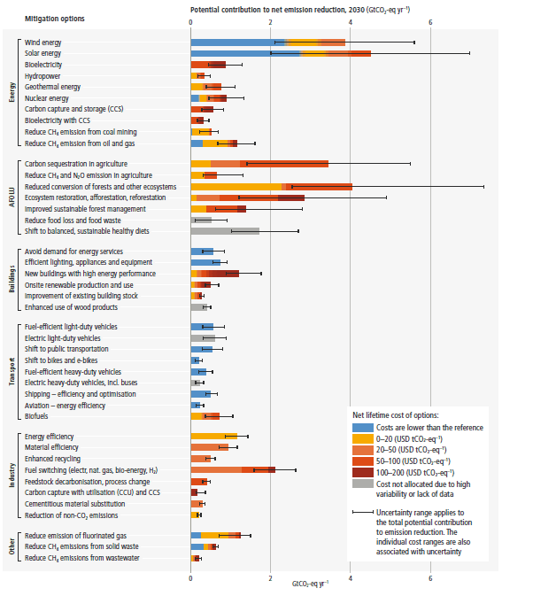
Recommended actions to cut greenhouse gas emissions in the near future:

Anti-science, inactivism, and unsupported conspiracy theories are not ok here.
founded 1 year ago
MODERATORS
you are viewing a single comment's thread
view the rest of the comments
view the rest of the comments

Any idea on what the measurements are on the Y axis?
Edit: if you follow the link if shows the measurements are in kJ/cm^2^. Which is something someone smarter than me will have to explain.
k = thousand
J =joules
/ = per
cm² = square centimeter
How many degrees are off from the avg tho? Just something to compare it to.
Look at the averages on that chart. Eyeballing it, the average should be around 70 kJ/cm2, currently it's about 85.
So it's about 20 percent more energy.
It doesn't translate directly to temperatures as the values represent how much energy is in a column of water that is 1cm2 at the top, and that column extends down until the water temperature drops below 26 degrees Celsius.
So it could be that the top of the column of warm water is mostly the same temperature as before but extends deeper, as opposed to the top of the column being a lot hotter than usual.
When the column is shorter, a hurricane will mix it with cooler water lower down via wave action, reducing the amount of energy available after it passes by. This year the column of water is deeper than usual, which allows two hurricanes to develop over the same patch of ocean in quick succession.
Thanks for the explanation 👌