this post was submitted on 15 Nov 2024
298 points (94.3% liked)
Linux
48688 readers
384 users here now
From Wikipedia, the free encyclopedia
Linux is a family of open source Unix-like operating systems based on the Linux kernel, an operating system kernel first released on September 17, 1991 by Linus Torvalds. Linux is typically packaged in a Linux distribution (or distro for short).
Distributions include the Linux kernel and supporting system software and libraries, many of which are provided by the GNU Project. Many Linux distributions use the word "Linux" in their name, but the Free Software Foundation uses the name GNU/Linux to emphasize the importance of GNU software, causing some controversy.
Rules
- Posts must be relevant to operating systems running the Linux kernel. GNU/Linux or otherwise.
- No misinformation
- No NSFW content
- No hate speech, bigotry, etc
Related Communities
Community icon by Alpár-Etele Méder, licensed under CC BY 3.0
founded 5 years ago
MODERATORS
you are viewing a single comment's thread
view the rest of the comments
view the rest of the comments

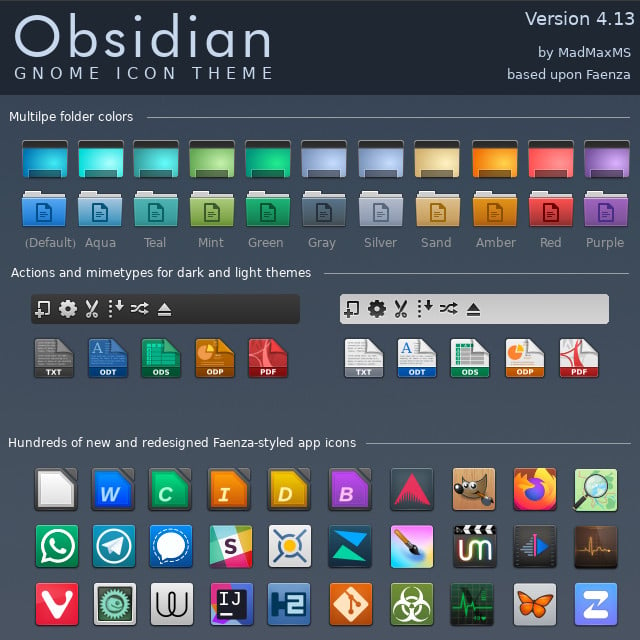
I miss UIs having lines and clear separations between elements. I loath this new flat style that everything has to have now, where you can't tell when one thing stops and another starts.
And you can't tell when something is active/focused or not because every goddamn app and web site wants to use its own "design language". Wish I had a dollar for every time I saw two options, one light-gray and one dark-gray, with no way to know whether dark or light was supposed to mean "active".
I miss old-school Mac OS when consistency was king. But even Mac OS abandoned consistency about 25 years ago. I'd say the introduction of "brushed metal" was the beginning of the end, and IIRC that was late 90s. I am old and grumpy.
I've got these articles saved, about the history of brushed metal on Apple software: https://512pixels.net/2013/03/brushed-metal-intro/ https://512pixels.net/2016/11/the-brushed-metal-diaries-beyond-software/
To be honest I loved it ... though maybe it has to do with the fact that I have a soft spot for 10.4 Tiger, due to personal (?!) reasons. After Tiger they started progressively tearing down the brushed metal components.
The FireTV os is worse. The active focus indicator is different between pages of the OS ignoring apps. Oh and it changes constantly.