Found in this great toot
Discussion of climate, how it is changing, activism around that, the politics, and the energy systems change we need in order to stabilize things.
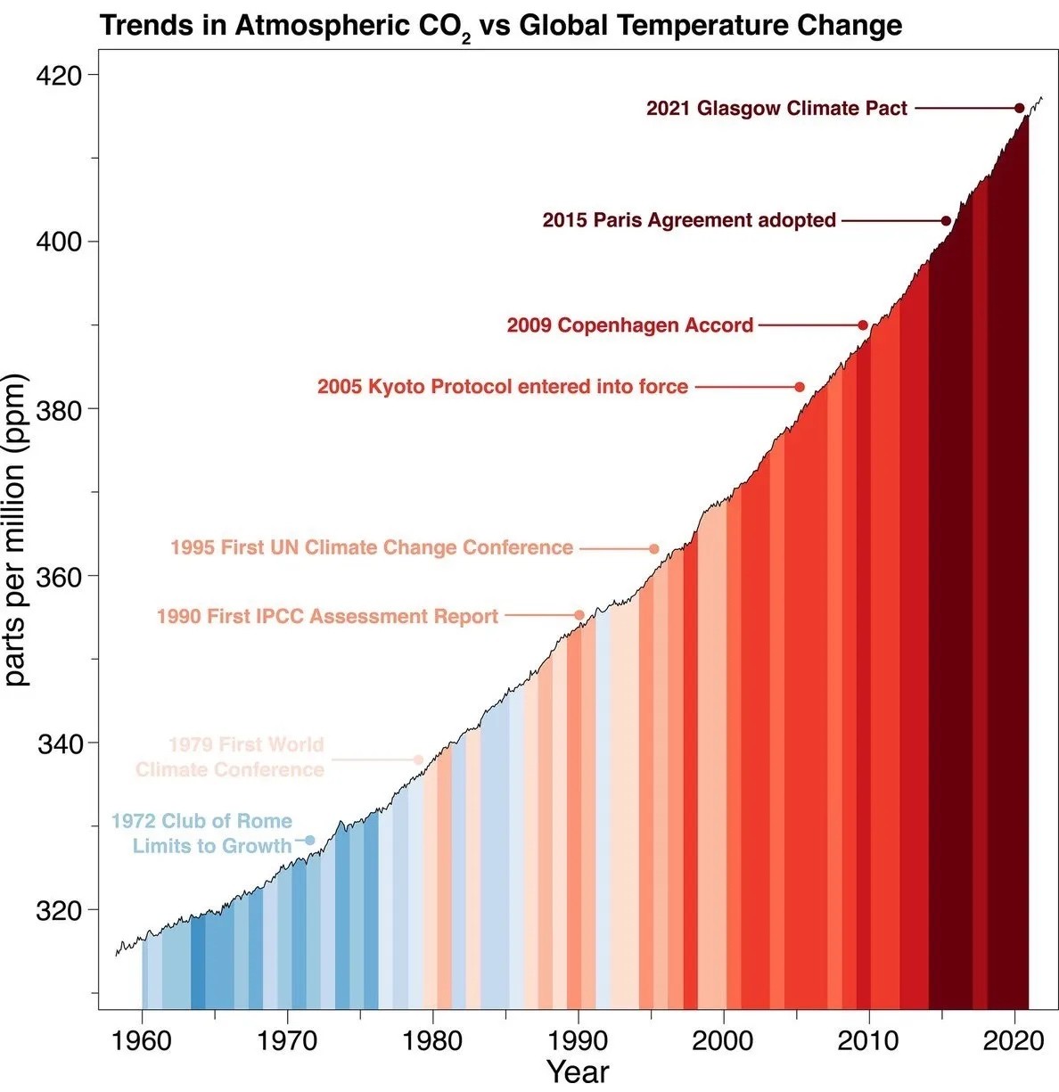
As a starting point, the burning of fossil fuels, and to a lesser extent deforestation and release of methane are responsible for the warming in recent decades:

How much each change to the atmosphere has warmed the world:

Recommended actions to cut greenhouse gas emissions in the near future:

Anti-science, inactivism, and unsupported conspiracy theories are not ok here.
Found in this great toot
The slope isn't exaggerated - it shows a linear trend, and it choses the only reasonable limits in order to illustrate this in the period. Starting the graph at zero would make no sense - you could easily illustrate the stability of global temperature by showing a graph of average temperatures starting at zero Kelvin.
What is true is that atmospheric CO2 is hard for most of us to interpret substantially. However, the graph is not setting out to effectively illustrate how much CO2 there is in the atmosphere, but rather the linear growth of atmospheric CO2 levels in spite of various efforts.
If the Y axis was secretly log transformed or something like that, there would be reason to worry. But it's linear, and the story told by the graph is accurate.
The instinct of checking the limits of the Y axis is a good one though.
by focusing on a smaller numerical range, the slope of a linear graph will become steeper. if the graph went from 0 to 420, the entire range of this graph would have to be compressed into about 1/4 the space, so its y range proportional to x will be only 1/4, and since that is what determines the slope, that will be substantially flatter.
I'm not attempting to dismiss or minimise what is shown on the graph, I just think that it needs the added context of what earlier CO2 levels were.
Of course selecting a range that shows the variation makes the variation more visible, but that doesn't mean it's exaggerated. There's nothing about 0 making it the natural point of comparison - some CO2 in the atmosphere is normal. What is important is the shape of the slope - the continued linear growth.
The graph does not give us enough information to substantially interpret what an increase of 100 PPM CO2 in the atmosphere actually means in the greater scheme of things, but that's hardly a fault of the graph - answering that would be a much bigger question. What it does show is that growth has not halted since the 1980s.
I guess it's also worth mentioning that this doesn't mean our efforts have come to naught - for all we know the growth would have been exponential, and we successfully made it merely linear. What's safe to say based on the graph is, however, that what we have been doing is probably not enough.
Also, it's kind of unfair to be equating each of those items because not all of them were actual actions taken to address the problem, and the actions are not equivalent or involve every country. The most substantial actions have only been taken recently, and no one promised that this train could be stopped in a few years.
But it shows us that these big climate summits don't really do anything, apart from generate even more pollution from private jets... They are just a big show to create the illusion of governments giving a shit.
Another interesting factoid, is that the USA does not include it's military emissions in its annual emissions reports, as that would reveal "classified information"..... The military industrial complex must fall, but that's most of the US government lol.
I’m fairly certain this is showing an exponential trend in CO2 emissions, not a linear trend. The slope changes as a function of time. Linear isn’t really a good fit for the data.