Found in this great toot
Discussion of climate, how it is changing, activism around that, the politics, and the energy systems change we need in order to stabilize things.
As a starting point, the burning of fossil fuels, and to a lesser extent deforestation and release of methane are responsible for the warming in recent decades:

How much each change to the atmosphere has warmed the world:

Recommended actions to cut greenhouse gas emissions in the near future:

Anti-science, inactivism, and unsupported conspiracy theories are not ok here.
Found in this great toot
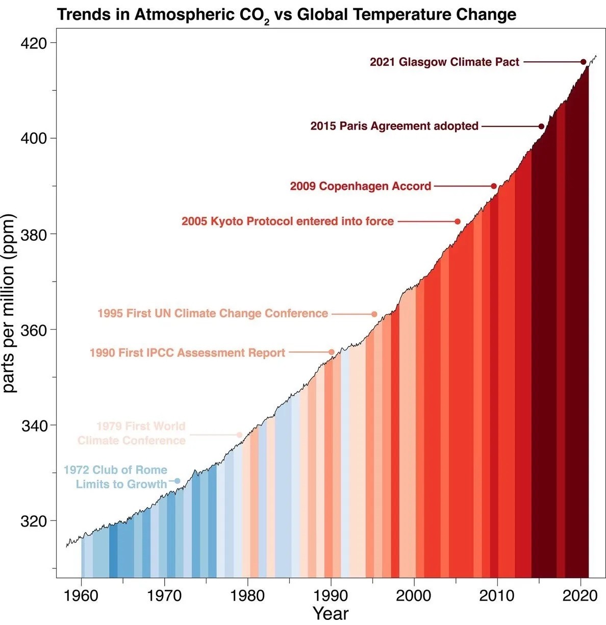
Wheres the scale for temperture change, yeah the colors indicate a trend from cold to warm but how warm isnt shown
this wasn't my exact complaint, but it's similar; the graph starts at 320 and goes up to 420, meaning the slope is intentionally exaggerated. if you want to show us how much worse things have become, give us comparison to earlier CO2 levels, otherwise this just gets dismissed as alarmist propaganda.
The slope isn't exaggerated - it shows a linear trend, and it choses the only reasonable limits in order to illustrate this in the period. Starting the graph at zero would make no sense - you could easily illustrate the stability of global temperature by showing a graph of average temperatures starting at zero Kelvin.
What is true is that atmospheric CO2 is hard for most of us to interpret substantially. However, the graph is not setting out to effectively illustrate how much CO2 there is in the atmosphere, but rather the linear growth of atmospheric CO2 levels in spite of various efforts.
If the Y axis was secretly log transformed or something like that, there would be reason to worry. But it's linear, and the story told by the graph is accurate.
The instinct of checking the limits of the Y axis is a good one though.
I’m fairly certain this is showing an exponential trend in CO2 emissions, not a linear trend. The slope changes as a function of time. Linear isn’t really a good fit for the data.