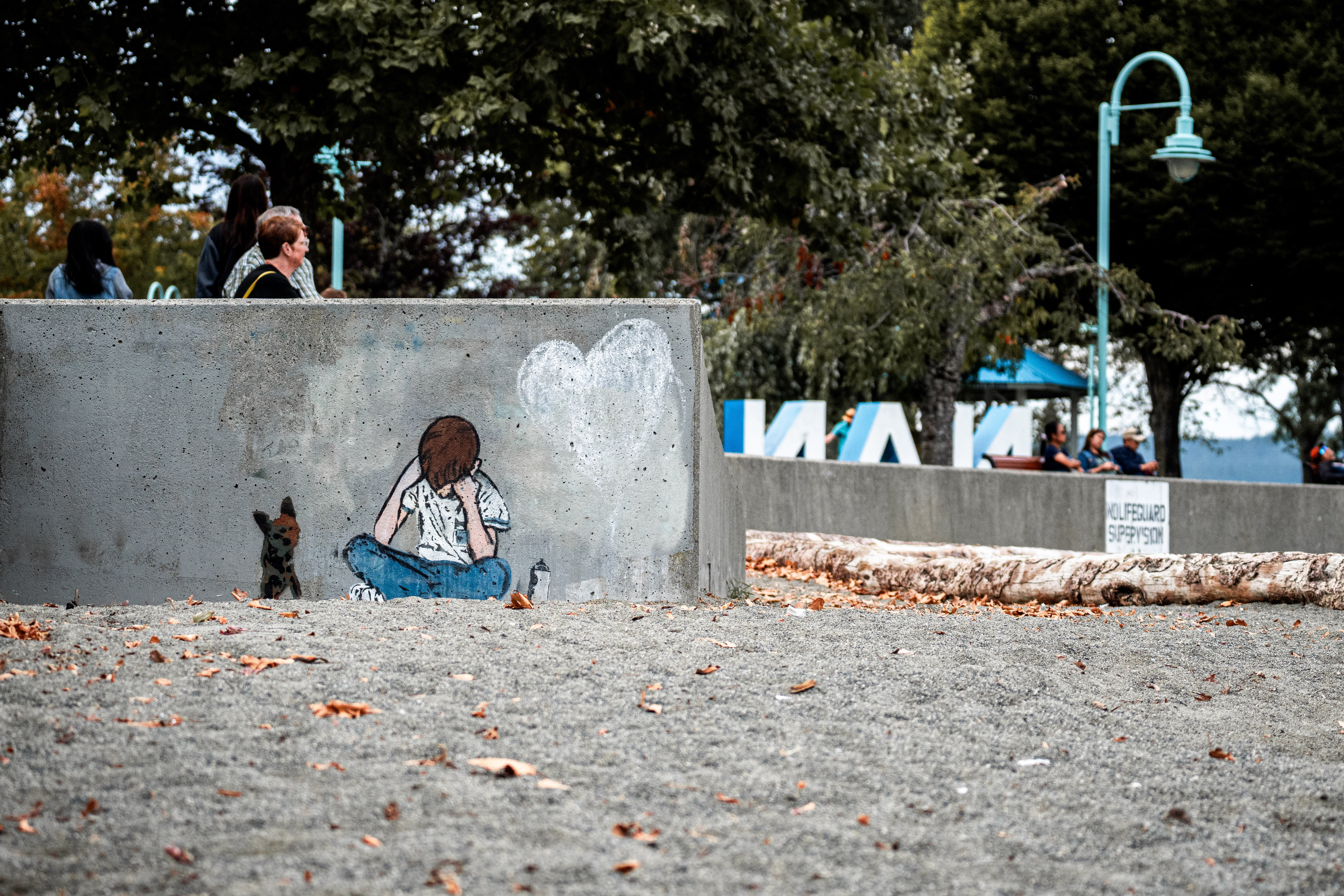
I like that vertically you have stacked people and green leaves above the slab, and rather bleak sand with dead leaves below in roughly equal proportions to the concrete slab: it suits the theme of the art/graffiti and its medium. I am wondering whether the right hand side could be cropped in a bit as it doesn't so much add to the theme (but perhaps you are following a rule of thirds thing).
this post was submitted on 11 Sep 2023
21 points (95.7% liked)
Photography
5887 readers
144 users here now
A community to post about photography:
We allow a wide range of topics here including; your own images, technical questions, gear talk, photography blogs etc. Please be respectful and don't spam.
founded 2 years ago
MODERATORS
Thanks for the critique! To be honest, most of the composition was based on luck for me - I saw the artwork on the concrete wall and its position on the beach is perfect - really the artist who painted the wall deserves the most credit. I did position the art to the left side (rule of thirds), I felt that showing a bit more space gave more "on the beach" feeling. I aligned the sand with the bottom third and then the concrete slab being proportioned equally was serendipity.
