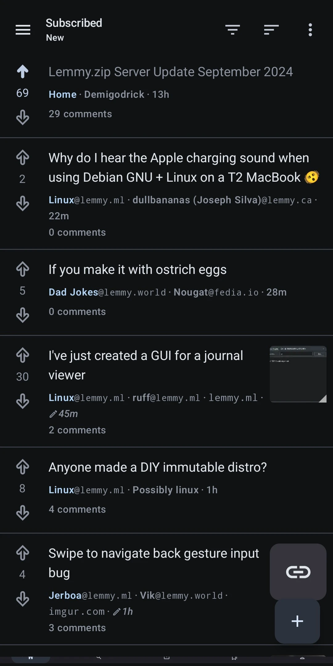
Presentation is very neat as of this update. Thank you!
Jerboa
Jerboa is a native-android client for Lemmy, built using the native android framework, Jetpack Compose.
Warning: You can submit issues, but between Lemmy and lemmy-ui, I probably won't have too much time to work on them. Learn jetpack compose like I did if you want to help make this app better.
Built With
Features
- Open source, AGPL License.
Installation / Releases
Support / Donate
Jerboa is made by Lemmy's developers, and is free, open-source software, meaning no advertising, monetizing, or venture capital, ever. Your donations directly support full-time development of the project.
Crypto
- bitcoin:
1Hefs7miXS5ff5Ck5xvmjKjXf5242KzRtK - ethereum:
0x400c96c96acbC6E7B3B43B1dc1BB446540a88A01 - monero:
41taVyY6e1xApqKyMVDRVxJ76sPkfZhALLTjRvVKpaAh2pBd4wv9RgYj1tSPrx8wc6iE1uWUfjtQdTmTy2FGMeChGVKPQuV - cardano:
addr1q858t89l2ym6xmrugjs0af9cslfwvnvsh2xxp6x4dcez7pf5tushkp4wl7zxfhm2djp6gq60dk4cmc7seaza5p3slx0sakjutm
Contact
No probs!
I'm trying to think of a way to mute the gradient at the bottom edge of a meta box (not sure what it's referred to in compose) when the content is three lines long or less

This idiotsincars content can't be two finger scrolled though the gradient sort of implies that it's longer than three lines
E: I worded this poorly. I was trying to figure out the term to suppress a containers inner gradient when you've reached the end of its content. Seems the gradient is persistent at the bottom, even with longer text.
There isn't a setting for it yet. With the rework Dessalines added a fade to the body.
Ah right, thanks for the info
Might be just me but I lost the navbar with home, search, notifications. If you squint enough in the screenshot it looks like it is simply cut off but a tiny bit left, so you can see. I tried tapping on the quarter of a button that I get to see, but they don't work.

Open up an issue on the github for this.
For those affected you can temporary disable navigation bar in settings. And then you can navigate using the drawer.
Same here except my navbar is missing entirely.
Same here. I was able to tap the sliver of a button successfully at least
Based 🙌
As someone that tries to condense posts and comments, I have 'Show action bar by default for comments' disabled. Now, as score location has been altered, I'm not able to see comment score. More problematic is there's no longer an indication of whether I have already voted on a comment or not.
In order to get this information now, I either must enable the action bar for every comment which fills a lot of the screen with buttons that I don't need, or press and hold the comment to expand the action bar manually. This is a reduction in displayed information that doesn't seem proportional to the benefit of a 'cleaner' style.
At the very least, I'd think the score should be put back next to the commenter's name when the action bar is disabled.
Comments with the action bar disabled:

Comments with the action bar enabled:

I noticed this as well and agree with everything you've said. Hopefully it's something that can be easily addressed for the next version, I doubt there's many people that would prefer to keep it as is when the comments action bar is disabled by default.
Thanks for the great effort. I'd like to feedback that 0.0.72 worsened the UX for me. Downgrading to your more awesome 0.0.71 release with cleaner UI 🙂