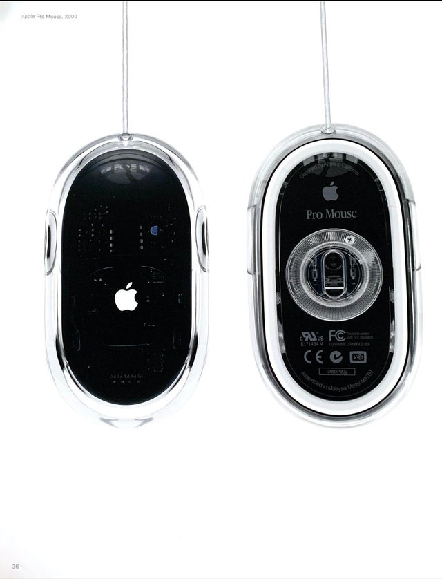
No offense but these things are horrendous to use. The mouse design has been largely perfected(and it ain't this design), what else is there to do besides add RGB to stand out?
Technology
A nice place to discuss rumors, happenings, innovations, and challenges in the technology sphere. We also welcome discussions on the intersections of technology and society. If it’s technological news or discussion of technology, it probably belongs here.
Remember the overriding ethos on Beehaw: Be(e) Nice. Each user you encounter here is a person, and should be treated with kindness (even if they’re wrong, or use a Linux distro you don’t like). Personal attacks will not be tolerated.
Subcommunities on Beehaw:
This community's icon was made by Aaron Schneider, under the CC-BY-NC-SA 4.0 license.
Completely ass to use. Form over function is bad.
It sure was purdy though.
One of the better examples of form over function. I really disliked actually using this mouse whenever I had to.
still better than the hockey puck nonsense it replaced.
It was certainly striking looking, as was the computers it matched with. I can't say I enjoyed using them, though. I don't mind the single button but the ergonomics were poor and hurt my hand after long sessions.
Apple has never made a mouse that didn’t suck. Fight me.
(Their trackpads tho, glorious)
sensel is gonna change that, hopefully.
Seems like Apple mice have always been form over function.
And then they created the Magic Mouse, the biggest turd ever created in the history of mice.
Apple fought hard against two-button mouse if I recall correctly.
