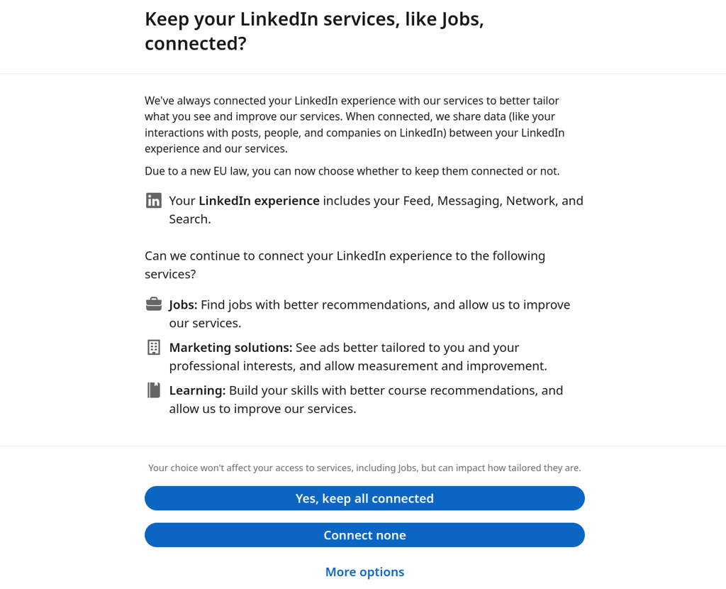
I'd say only the ads are the issue, but the 'more options' button is kinda hidden. As if it's trying to lull you into accepting all. Also good choice to put it in the middle.
Privacy
A place to discuss privacy and freedom in the digital world.
Privacy has become a very important issue in modern society, with companies and governments constantly abusing their power, more and more people are waking up to the importance of digital privacy.
In this community everyone is welcome to post links and discuss topics related to privacy.
Some Rules
- Posting a link to a website containing tracking isn't great, if contents of the website are behind a paywall maybe copy them into the post
- Don't promote proprietary software
- Try to keep things on topic
- If you have a question, please try searching for previous discussions, maybe it has already been answered
- Reposts are fine, but should have at least a couple of weeks in between so that the post can reach a new audience
- Be nice :)
Related communities
much thanks to @gary_host_laptop for the logo design :)
I gotta say as an American I really appreciate some of these recent things the EU is doing with privacy. They seem to have a bigger impact here than any actions American politicians come up with, which is depressing, but still deeply appreciated
But still with dark pattens. Is that allowed?
Good question. AFAIK, it isn't in Germany, but many cimpanies don't care.
I have filed a complaint with the gdpr representative in bavaria this month. Have you done your duty yet? :)
(I‘m joking of course but how awesome would it be if we (Fedi users) challenged each other to strike back like this every month? Like the ice bucket challenge but for privacy?)
How so? Does "more options" have better options?
All or nothing choices while "more options" is made easy to overlook on purpose.
I’m so tired of having no rights to privacy simply because I live in America.
