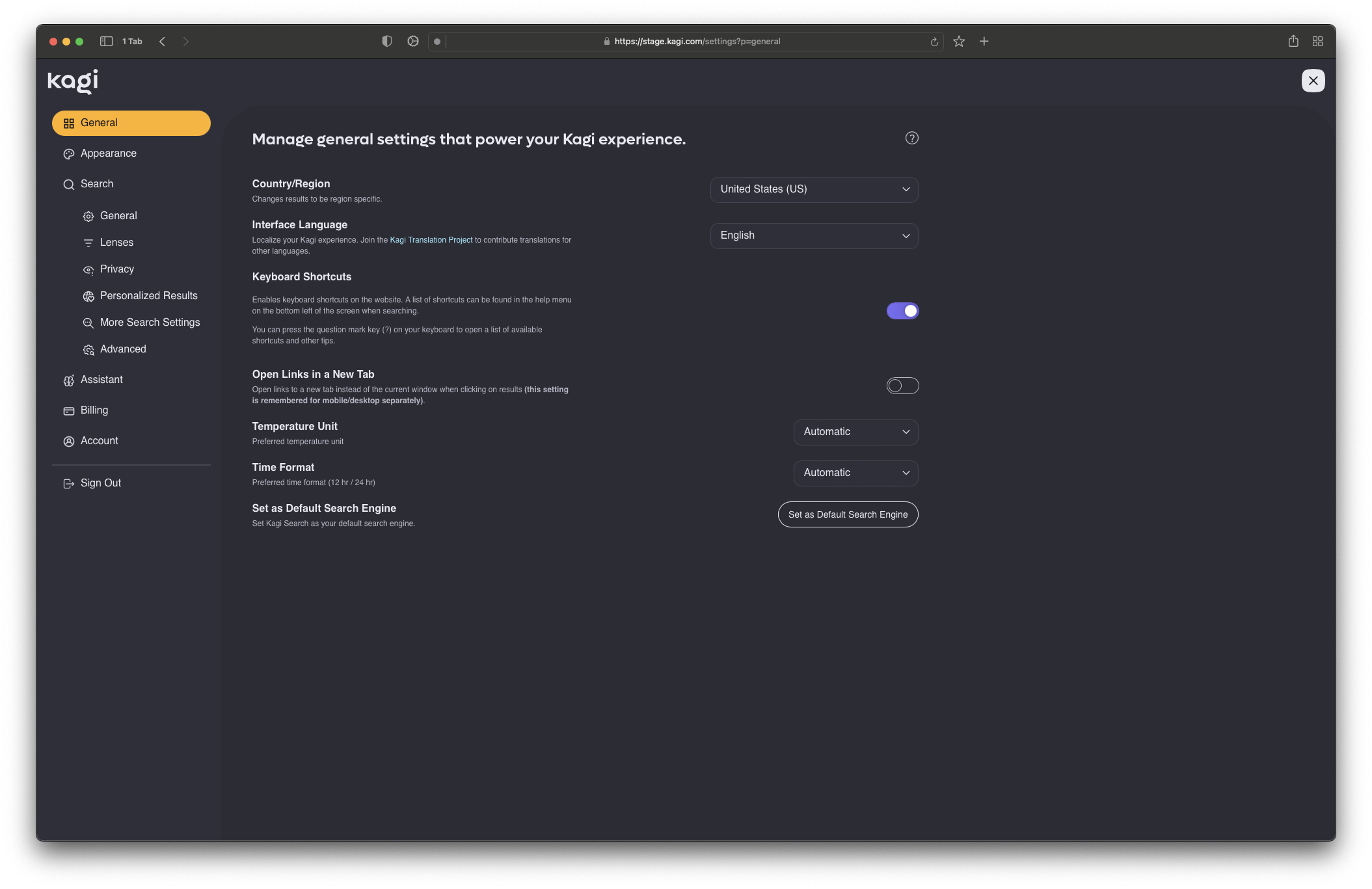
The settings layout is a big step up but I'm not such a great fan of the theme changes. The new "Royal Blue" theme has lost quite a bit of contrast.
Kagi search engine
A community to discuss the innovative paid Kagi search engine and related topics.
Kagi Inc. is a company created with the mission to humanize the web. Our goal is to amplify the web of human knowledge, creativity, and self-expression.
Rules: Be moral.
Note: This community is not affiliated with Kagi Inc.
I already put in a feature request for true black...
Yeah I liked the previous dark theme. Not dark enough now with either of the options.
Guess you can theme it. Will have to play around with it.
https://help.kagi.com/kagi/features/custom-css.html
This one wasn't horrible: https://github.com/Vexz00/kagi-nocturnal-theme
The box around each search result changes padding while I scroll giving it an odd "jelly" effect. At least on mobile anyways. Will have to mess with the CSS myself I guess.
Oh! I did not see these settings on mobile.
Had the exact same thought, not sure how it got approved, since it's become a lot less readable.


