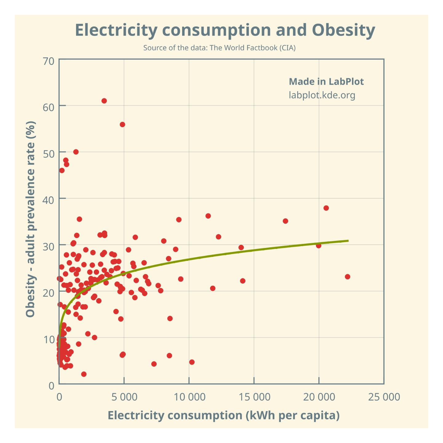
Is the act of distinguishing a question from an answer as difficult as recognizing spurious correlations?
The question has been raised earlier by others,. See for example this paper from 2021 (Measuring the effect of energy consumption on the epidemic
of overweight in Latin America and Caribbean countries):
@IanSudbery @programming
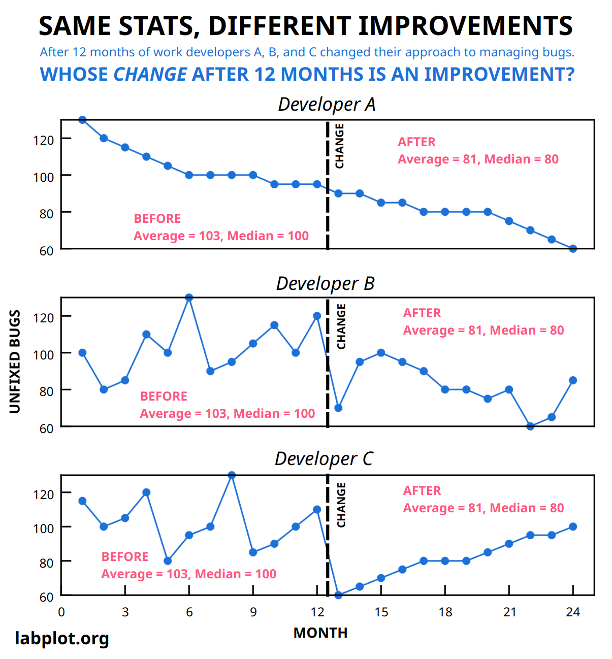
Assuming a steady flow of bugs of the same kind, we share the same line of reasoning.