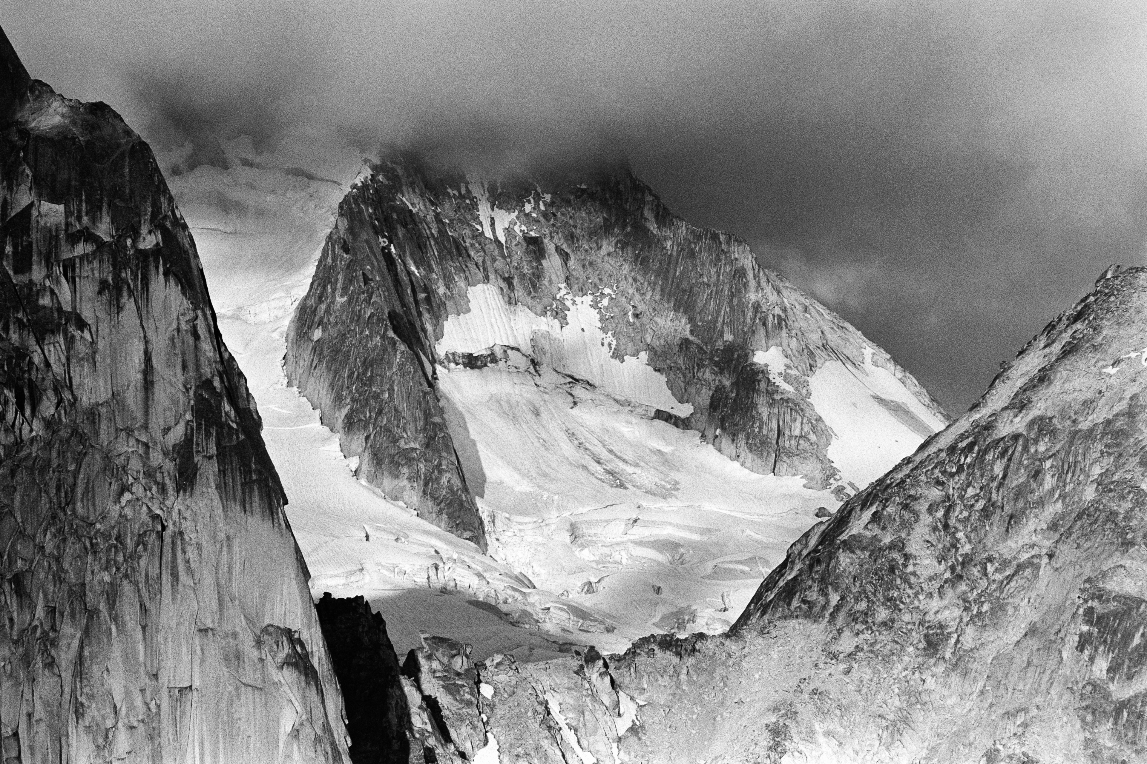
Shot from East Post Spire. One of my favourites!
View from the top of yesterdays mountain bike ride!

Right? It's awesome having Bernard turn into a giant mixed use path with bonus patios. This is in Kelowna of all places, one of the most car happy places with dismal transit, and despite that most people still get behind this.
So here's another angle. I'll run reds on my bike when traffic is light, but I do it for the sake of the drivers. Surprisingly in Kelowna we have decent bike infrastructure, so in a lot of places I could just hit the button to change the lights immediately and give myself the right of way. Then I feel like an ass when three cars queue up at the red when I'm long gone. I'd rather just treat the red as a stop sign If it's safe to do so.
I think it's the nuanced case by case decision making that lower speeds and overall defensive nature of cycling offer isn't understood by people who don't bike regularly. Not sure what the solution is there.
Some thoughts on these:
The "oversized triangle cantilevered over a smaller box" minimalist modern look can be cool, and I do like some of the smaller, proportional designs. The way that design language scales to the larger four and six plex units looks kinda silly. Too focused on a cohesive design language across all the designs, even when it doesn't suit.
Why no overhangs? Canada has weather. Overhangs shade our windows, keeps rain off the walls, provide soffits that vent our roof assemblies. Unvented roofs are expensive to detail well and generally don't perform as well. Going to look a lot less sleek and minimal when you slap some cheap aluminum eavestroughs on there, or was that omitted deliberately to turn all the rain cascading down the walls into a water feature?
These are supposed to be affordable homes. I dig the attempt at a clean Scandinavian aesthetic. Looks really good with hidden gutter details, heat treated wood siding or shou sugi ban or something, with nice metal tilt and turn glazing. Something tells me that won't translate well to being slapped together as a budget friendly, beige and off white Hardie clad, white vinyl casement, giant upvote arrow of a house.
Such a good snack. Works for any gourds really. Just did a butternut squash soup and fried up the seeds to sprinkle on top of each bowl.
Photography. Yes you can do it with your phone, but a proper camera makes the process much more intentional. It can cost a fortune, but it can also be relatively cheap. I started off with a little digital camera when my daughter was born to document her kid years, now I'm dragging large format sheet film cameras up mountains on camping trips. Any mirrorless or DSLR from the last decade will get you going. Also photography pairs so well with basically any other hobby and sometimes can provide the motivation to do the other thing. Tons of YouTube videos and channels on the subject.
Biking. Great as a way to get around town in a healthy way. Brings about that joy of being a kid just ripping around the neighborhood. Then I started getting more and more into mountain biking, which has been a fun rabbit hole. Progressed slowly to avoid injury, and now I'm ripping blacks at the bike park and just raced my first enduro last month.
Running. Trail, road, whatever, just run. The best stress relief imaginable, and the best time to work through whatever is in your head. You'll feel better, maybe not always in the beginning but after a run definitely. Buy some shoes and off you go.
Climbing. Noticing a physical activity trend here. Climbing is awesome though. Such freedom of movement, it's like self weighted vertical yoga. Bouldering is a great place to start. No ropes or technical ability required, just bring a friend to a gym and they'll get you started. From there you can get your own shoes, get a membership, learn to top rope, meet some more experienced climbers, go outside with them, learn to lead ... another deep rabbit hole.
Hope those give some inspiration!
Film is crazy advanced. One of those "how did humanity figure this out?" kind of things. Smarter Every Day YouTube channel did a thorough tour of Kodak and it's pretty fascinating all that goes into it.
The deliberate act of shooting that the financial and time cost definitely makes better photos. You can do that with digital as well but it takes more discipline. Far easier to shoot a dozen and hope one works than to think and come up with the right one from the start.
Both have their place I think. Any time I shoot a race, wedding, or a once in a life trip I'm so glad it's digital! Being able to do a 10 shot burst and nail the facial expression is pretty awesome. Then slowing down and going on a local hike and setting up my 4x5 to take one shot, or a photo walk around town with an old SLR is a blast too.
Maybe I just like photography?
It depends. Kelowna is a bit north for reds so you'll get your pinot, gamay, zweitgelt, etc and they're decent. I find the only good merlot, syrah, foch, even tempranillo, fuller body stuff is mostly Similkameen Valley and south near the border. I'd say there's definitely solid red options but they come at a price. Chilean or even French equivalents for less.
Agree to some extent, but a counterpoint; some of us who do need them spend a lot of time doing the adventure things and less time making money, so not enough means or care to have nice normal or urban clothes on top of the expensive adventure kit.
So for sure, a bunch of Arcteryx clad status symbol signaling happening down at the local brewery, but don't judge too harshly. Some of us just came down from the mountains long enough to have a pint.
Climbing! I've never been fond of weightlifting, but lifting myself up on the wall is way more fun! It's incredibly physical, and there's an equally important mental problem solving aspect to it. Most cities have a climbing gym these days and it's a lot more approachable than most people think. Bouldering especially only needs shoes and maybe a chalk bag. Just short but hard climbs that are usually only a few challenging moves. No ropes or harnesses, just big squishy mats to land on. It can also be pretty social with most gyms having a good community, and if you really take to it there's always room to grow into actual outdoor rock climbing.
Biking for commuting and errands is great as others have mentioned.
Running too. Just needs shoes and some comfy clothes. Even starting at a one km run doesn't seem like much, but you'll be surprised how much further you can go if you stick with it.
Shot from East Post Spire. One of my favourites!
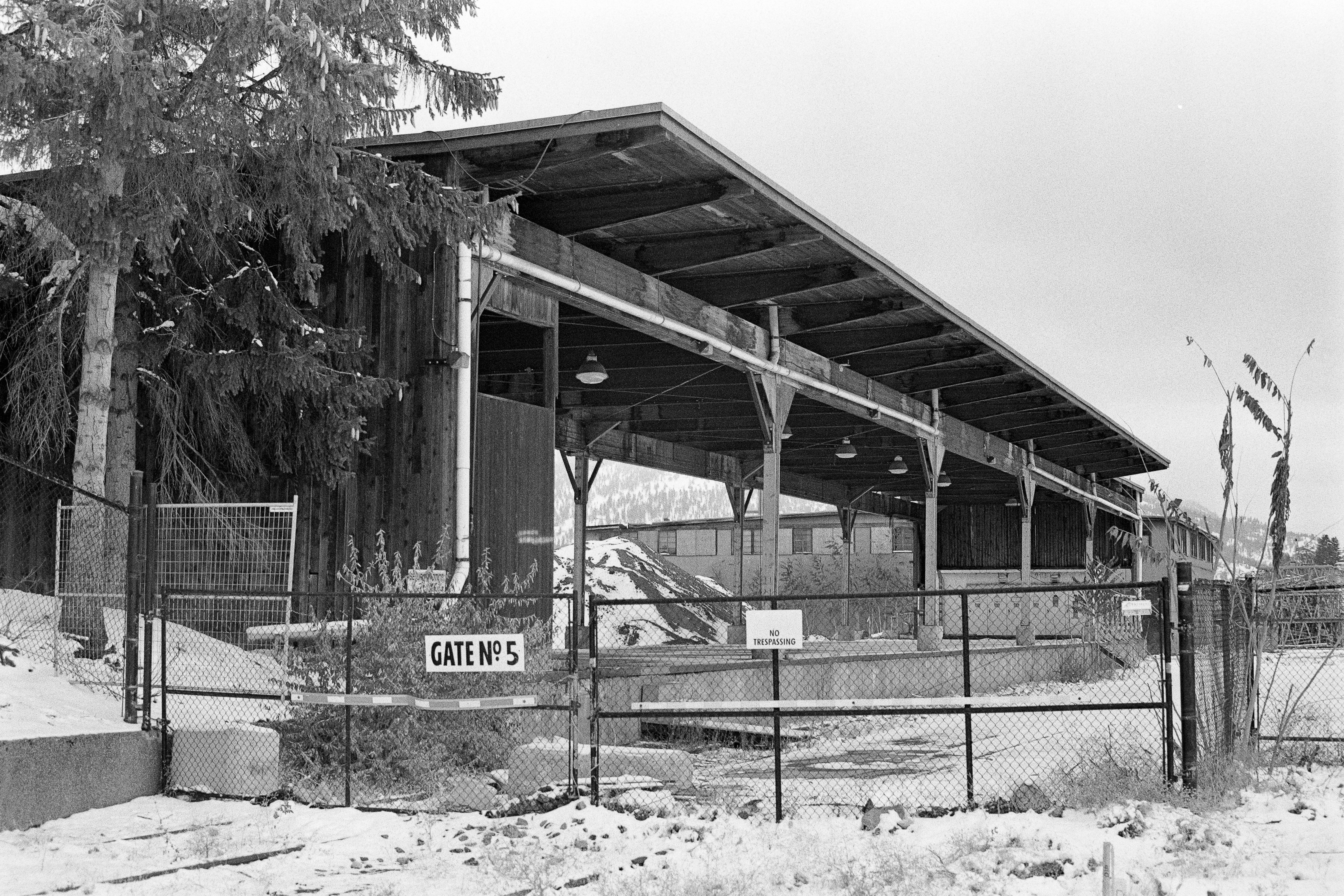
Photo walk back in winter. Old mill site that's being rehabilitated for future development. Make a point to wander by every now and then and document the progress.
Brake light Festival lol how have I never heard that. Perfect summary of the 401.