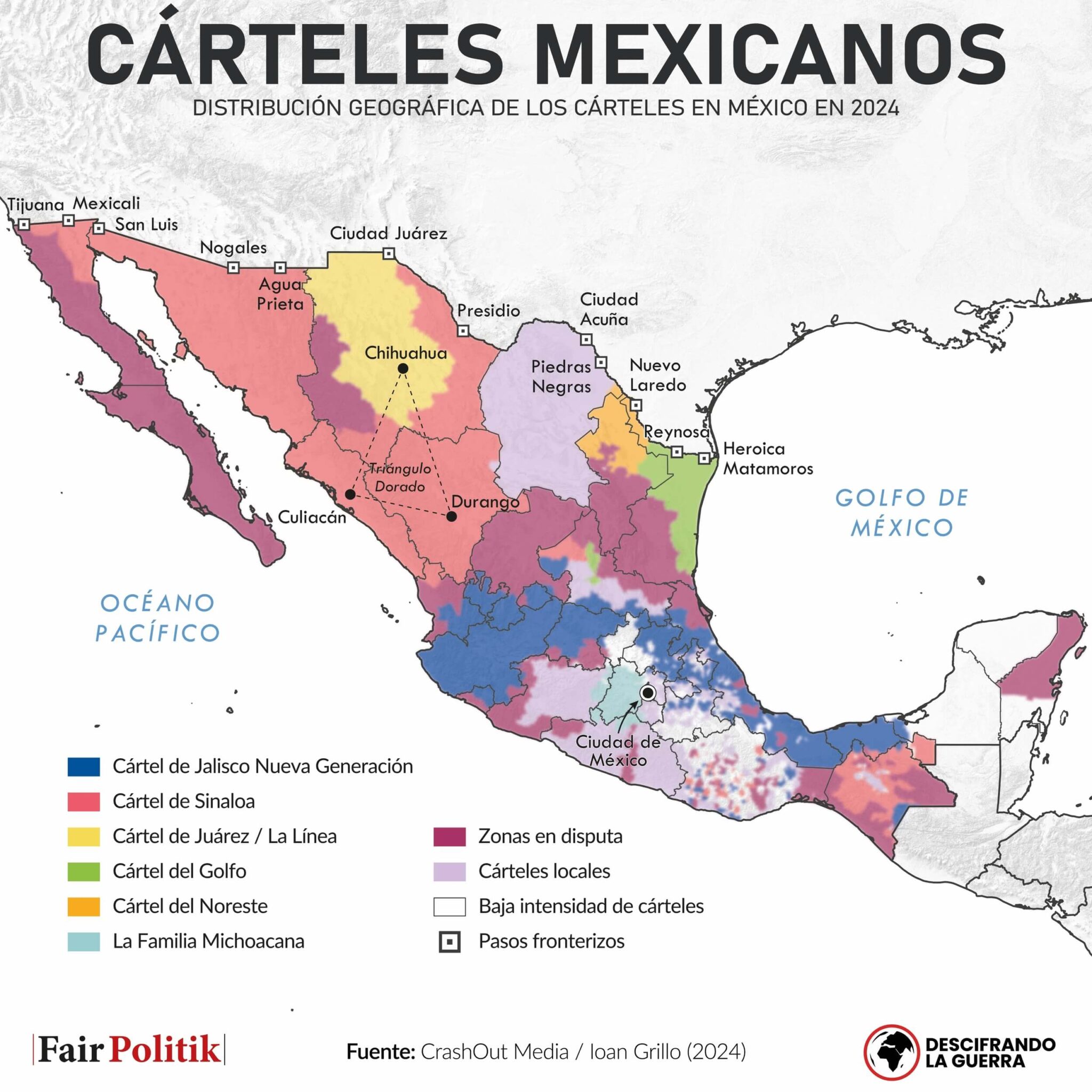
Según Wikipedia ya no existe, debido a conflictos internos y la captura de varios líderes.
First I assumed you lived close by, but then I saw in your username that you are Czech. So now I assume that you are some geoguessr wiz that can recognize any shopping center in the world from a reflection in a bus window.
I found this map of dominant tree species in Germany while investigating it:
https://atlas.thuenen.de/layers/geonode:Dominant_Species_Class
Indeed, there is are significant difference between the maps. Perhaps most notably in Baden-Würtemberg where there seems to be a lot of fir. But I also think there is a a clear correlation between the maps. I also find it interesting to see the correlation between the suitable habitat for oakwood and the absence of forests.
Who the fuck made this inforgraphic?
It's from Wikipedia. Admittedly, I didn't do much fact-checking and just trusted it. But of course you can always contribute by improving the map.
Cool map! I spent quite some time looking at the many details. Also interesting to see that the Chinese were so aware of world geography at the time, even if it was thanks to exchanges with Europeans.
You think so? My impression of the Netherlands is that the staple food is fries with mayonnaise, maybe with some broodje kroket in between. In general the diet consists of a lot of butter, white bread and sugar. To me it does not seemt surprising at all that they eat least vegetables in Europe.
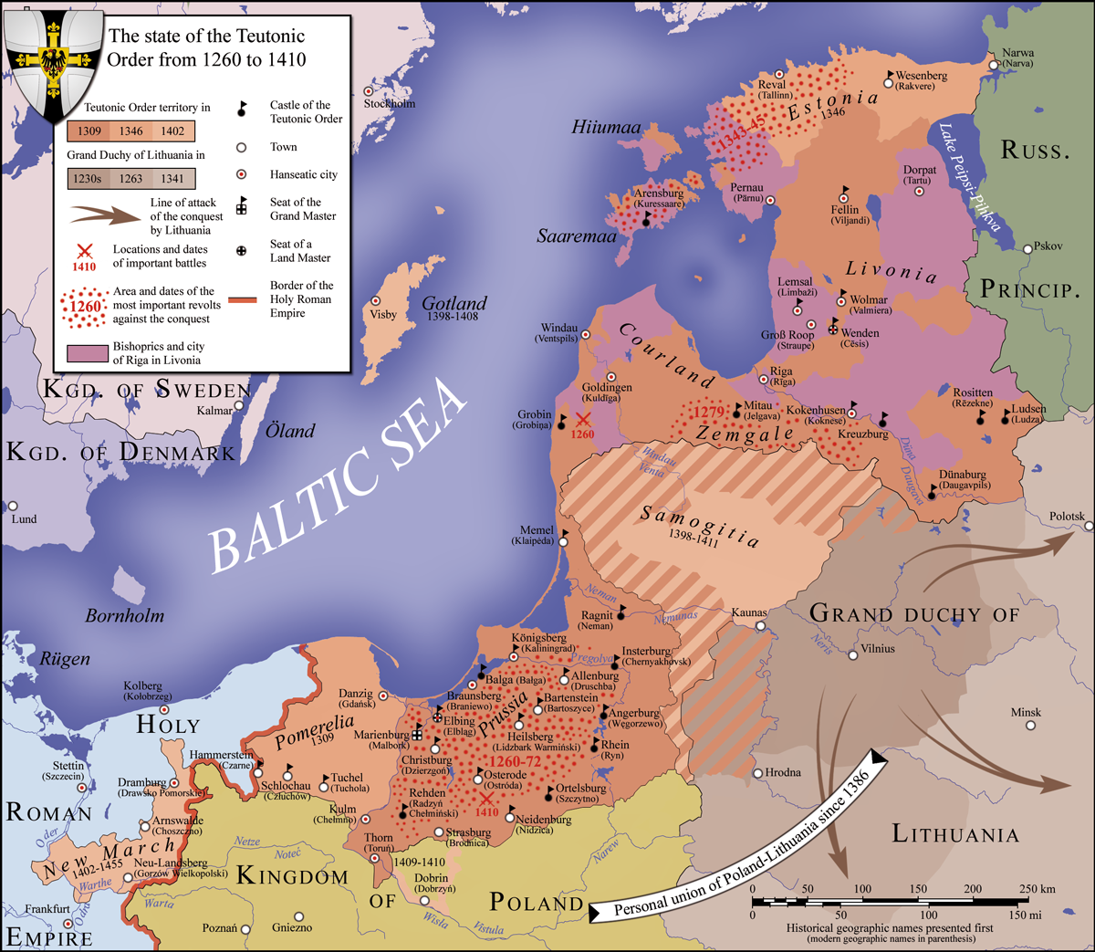
It has often been noticed that differences along the historical borders exist in Poland. See for example this article.
Here's another article discussing the differences, and interestingly claims that the difference between the election result in former Prussian and Russian parts of Poland is likely due to other factors.
Thanks for pointing that out. You're right. I messed up with the title. What i intended to say was that the scale was relative. But the title is corrected now.




Still some solid work. Thanks for saving us all from the unreasonably harrowing ignorance of not knowing exactly where a random picture on the internet was taken.