sheodox

joined 2 years ago
MODERATOR OF
 

cross-posted from: https://lemmy.world/post/25586204

alexandrite.app - !alexandrite@lemmy.world - Github

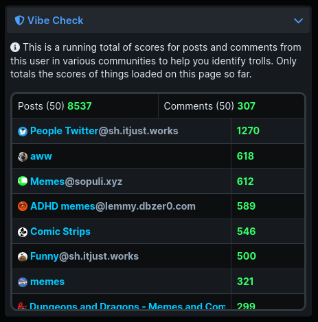
The main feature of this release is just for moderators. If you're the moderator of at least one community you'll see a new "Vibe Check" section in the sidebar when viewing a user page which is meant to help you identify trolls. When you're viewing a user's profile page, as you scroll (loading additional posts and comments) it will total up everything you've loaded so far, and the scores in various communities. This might be useful if you're trying to gauge the intentions of a commenter and you want to see if they're frequently upvoted in certain communities, or if they're frequently downvoted in other places.

vibe check example screenshot showing scores in various communities

I'm limiting this to just a mod tool, because I know incentivizing paying attention to scores is frowned upon on Lemmy. That's also why it doesn't total up everything (unless you happen to scroll enough to load someone's entire post history), as it's just meant to give a 'vibe check'.

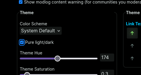
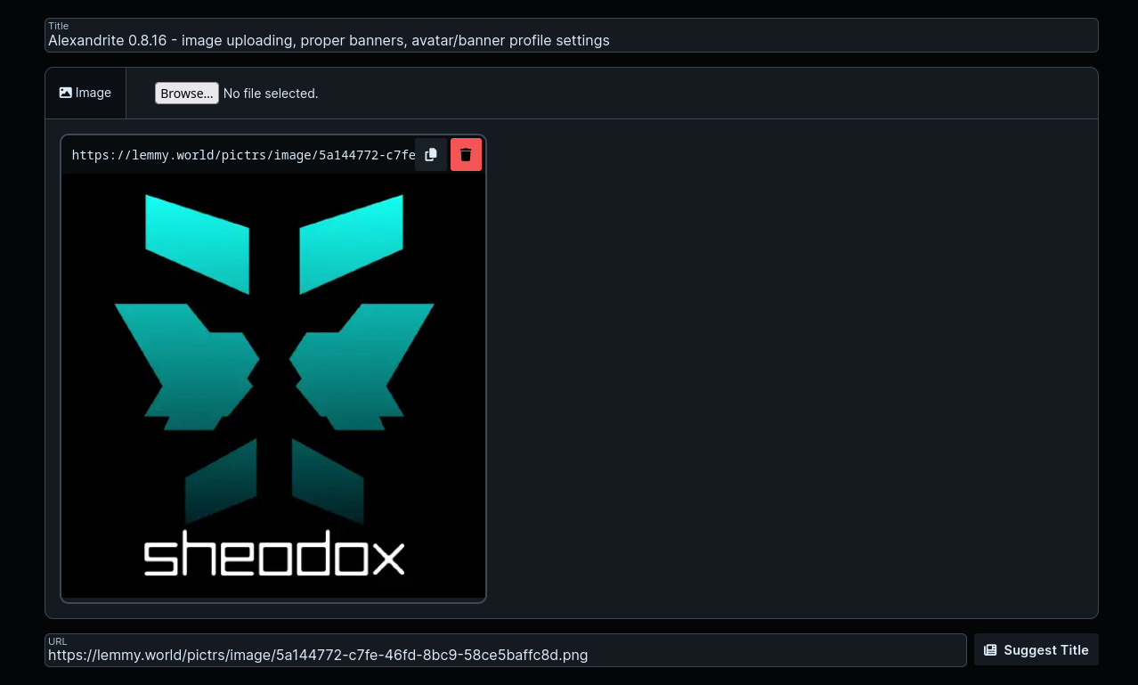
Beyond that all that really changed was some theme changes. The frosted glass backgrounds on cards are more visible (especially in light mode where it did almost nothing), and in light mode the name of the user/community in the feed banner doesn't have a very out of place looking dark text shadow.

That's it for now! Let me know what you think, or if you have any other things that would help you as a moderator!

[–] sheodox@lemmy.world 1 points 5 months ago (1 children)

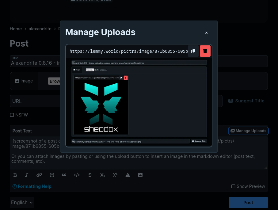
It might not help because it's in svelte and it doesn't look like you're using lemmy-js-client, but this is an example of how I do it in Alexandrite using lemmy-js-client. The onPaste function handles the paste event on the markdown editor textarea when someone pastes with an image in their clipboard, and the onFileInputChange is the change event for an <input type="file" /> element so when someone selects a file it uploads and the input's label can be styled like a button. Here is the client's fetch function which handles the authorization header and whatnot. You can upload client-side without a proxy server for any instance running a newer version of Lemmy than like.... 0.19.0? I didn't want to be responsible for proxying image uploads so I waited to add image uploading in Alexandrite until I could do the uploads directly client side.

[–] sheodox@lemmy.world 4 points 5 months ago

Good to know!

I can see how many unique users view the site in 1, 7, or 30 days, and I think after a year of no updates the 7 day average is pretty close to what it was still. Nice to see so many people liking my site!


cross-posted from: https://lemmy.world/post/25135715

alexandrite.app - !alexandrite@lemmy.world - Github

Hey, got some new updates for ya!

I added instance blocking, and completely redesigned the page for managing blocks. For all three categories you're able to search, so you don't have to go to someone's profile or find a post by them to find a block button to click. Honestly this page looked awful before, the sizing was weird, if you blocked something with a long name the 'unblock' buttons would be huge. I mostly copied the features available on lemmy-ui (like the searching, and the fact that instance blocks are a thing now).

screenshot of the blocks page

Tooltips in a couple places got some big upgrades!

User tooltips now show the full 'address' of the user (which it did before, but it wasn't super obvious what you were looking at), and you can now see when they made their account.

screenshot of the tooltip shown when hovering over a link to a user

Community tooltips got the same address/origin date.

screenshot of a tooltip shown when hovering over a link to a community

When you hover over a crosspost link it additionally shows the crosspost's title, who posted, when, the score, and comment counts. This should make it a lot easier to see where other discussion is actually happening.

screenshot of a crosspost tooltip showing a different post title

The card layout has a new feature, a nice frosted glass background. This looks similar to how Photon renders its link previews. If you're not familiar with it, this is what I'm talking about.. The effect is fairly subtle because it stretches over the entire card and it could be distracting, I wanted to make sure a fully white image wouldn't make the text too hard to read.

It's on by default, but you can turn it off with the "Frosted glass background" checkbox in Alexandrite settings when your Feed Post Layout is set to Cards if you'd like. If you're curious how it's done, it loads a low resolution thumbnail, places it with a low opacity behind the card, and blurs it so it's less distracting and hides how pixelated it is. It works because all the gray background colors on the site (like all the gray backgrounds on cards) are transparent so when stacked on other gray backgrounds there's always a contrast in color without any extra work. If you don't want to load extra images just for this, or if the blur makes the site lag on a low spec device (didn't notice any impact on my pc), then you might want to turn this setting off.

Screenshot of a card showing a photo of a bunny in some very green grass, the colors from the image are visible

Besides that, I bumped the node version the docker image uses, and I think that's about it.

Let me know if there's any features Alexandrite is missing that you'd really like! Especially interested in features you want that the default Lemmy UI has that I haven't added yet (like instance blocks until now, community creation/editing, emojis, user/community search when typing a @ or ! in the markdown editor, etc).

[–] sheodox@lemmy.world 2 points 5 months ago (1 children)

Ooo I love it! What lens did you use? I bought a cheap old Pentax lens that has some cool looking chromatic aberration like on the branches in your photo and I love it.


cross-posted from: https://lemmy.world/post/24943349

alexandrite.app - !alexandrite@lemmy.world - Github

This time it's mostly UI changes I really wanted to make, and some things people have asked for.

All toolbar toggles and dropdowns are now these nicer looking dropdowns. They look a lot more consistently sized, everything has a label I also added "Moderator View" into that new dropdown.

screenshot of top level feed dropdowns

The search page looks way nicer now, here's the before:

old search page toolbar

And now:

new search page toolbar

Added an option that lets you toggle between relative and absolute dates

absolute date screenshot relative date screenshot

Added an option for completely white/black backgrounds

pure light/dark theme setting


cross-posted from: https://lemmy.world/post/24823273

Smaller release, mostly focused on some styling changes and easy features.

In the settings you can now set a default comment sort, also added "Controversial"

screenshot showing the default comment sort setting

Now in the community/user sidebar and community search results you will see the full 'address' of a community/user. Clicking the text or the button on the right side copies it to your clipboard. In search results this makes it a lot easier to see what exactly the community is, not just what the display name says it is.

screenshot of a community sidebar

screenshot of a community search for 'games'

When viewing the inbox, the "No More Messages" message has a "View Read" button, so if you wanted to view an already read notification you've got a nice big button to get there.

screenshot of an empty inbox

Buttons in the community header aren't transparent anymore so they're easier to see if the banner's image is busy.

screenshot of the header of a community

[–] sheodox@lemmy.world 6 points 5 months ago

This was the most glaring missing basic feature for so long, glad it's finally in, I don't have to go back to the default ui just to write my announcement posts anymore. It wasn't possible to upload images from third party websites last time I was actively working on Alexandrite, and I think it's been possible for quite a long time by now and I'm finally getting to it.


cross-posted from: https://lemmy.world/post/24730515

alexandrite.app - !alexandrite@lemmy.world - Github

Finally added image uploading, so this is going to be my first update post with images I'll be able to write all on Alexandrite :D

As mentioned in the post you can now attach images to things, this means both on the post via the file selector like on lemmy-ui:

screenshot of a post creation form with an image attached, filling the url field

Or you can attach images by pasting or using the upload button to insert an image in the markdown editor (post text, comments, etc).

screenshot showing the Manage Uploads dialog on a post's text

You can also set your avatar and banner on the Lemmy tab of Settings

settings page showing a couple of file inputs

Banners on communities and users now show in the feed header instead of a smaller image at the top of the sidebar.

screenshot of the front page of c/amtrak

The sorting of communities when selecting one to make a new post (both the alphabetization of your subscribed communities and the popularity sorting of the search results) is better.

Fixed a 400 error that was happening when viewing modlog actions on a user.

This was the biggest change in quite a while, so please let me know if you have any issues with the update! Thanks for all the support, love hearing people like the stuff I'm making :)

[–] sheodox@lemmy.world 15 points 5 months ago

I don't think so, at least when I scroll my pixelfed feed it loads images from various domains.

browser dev tools network tab showing various domains


cross-posted from: https://lemmy.world/post/24517321

This release mostly is a redesign of the instance/community/user sidebars on the right side of those pages. Things are in clear sections, each in a collapsible section that remembers if it was open. So if you're tired of seeing your instance's description every time just close it and it'll stay closed.

Instances and communities now show their full stats, and there are now pages for the legal info and linked/blocked instances. The instance sidebar also shows the list of admins.

instance sidebar screenshot

If you use the 'Redirect' feed layout setting added in the previous release it now responds to clicks directly on the image or the background of cards.

When looking at your own profile there will be an "Edit Profile" button at the top of the sidebar.


cross-posted from: https://lemmy.world/post/24420184

Hello, it's been a while!

I did most of this release like 6 months ago but never got around to finishing it up until yesterday.

There's a bunch of small theme changes, biggest being a slightly different header bar, and in general a lighter light theme and darker dark theme. dark theme screenshot

light theme screenshot

There's now a search field in the sidebar which lets you quickly search through your subscriptions, with a link to a full community search. You can search for a community by name, or for example @lemmy.world to see all from a certain instance.

sidebar search demo

By default now when using the "Card" layout the vote buttons are on the left now and all the buttons on this layout are a bit larger. If you prefer the vote buttons on the right like it was you can change it back in the settings.

new card layout demo

card vote button alignment setting

On all the feeds there's now a refresh button on the bottom right so you don't need to refresh the whole tab.

refresh button screenshot

There's a new "Feed Layout" option that makes it so clicking post links will bring you to that post page directly instead of opening it in the overlay or a second column.

redirect option

That's about it for now! I hope to add some more missing features soon!

[–] sheodox@lemmy.world 4 points 2 years ago
[–] sheodox@lemmy.world 3 points 2 years ago

I generally prefer things to be on Github. I don't get notifications when people make new posts on here so I just have to check it regularly, but if you make an issue on Github I get an email about it, and it's easier to track.

If you have a bunch of ideas, it'd be nice if you separated them out into separate Github issues, so I can close the ones I've finished if I decide to take on the work!

Thanks for asking!

[–] sheodox@lemmy.world 3 points 2 years ago

Oooh that's an interesting idea. Maybe in the future!

[–] sheodox@lemmy.world 4 points 2 years ago

Thanks! I'm glad everyone's liking it! Pretty exciting actually having an audience for one of my side projects for once.

[–] sheodox@lemmy.world 2 points 2 years ago

Just updated with a few fixes I found, probably going to release this soon!

[–] sheodox@lemmy.world 2 points 2 years ago (1 children)

I'm not familiar with Librewolf, but are there any extra settings you can change to allow localStorage? I think browsers usually categorize it similarly with cookies so I'd imagine your cookie settings should already cover it, but just in case.

Alexandrite stores all its data in localStorage. For Alexandrite-specific features that Lemmy doesn't officially support itself (like favoriting communities), there's really no other place for it to store your settings.

[–] sheodox@lemmy.world 2 points 2 years ago (1 children)

That'd be fine, but I'd prefer a Github issue if you can! Makes it easier to track things is all, but no big deal.

view more: next ›