this post was submitted on 30 Jul 2026
554 points (98.8% liked)
RPGMemes
16927 readers
21 users here now
Humor, jokes, memes about TTRPGs
founded 3 years ago
MODERATORS
you are viewing a single comment's thread
view the rest of the comments
view the rest of the comments
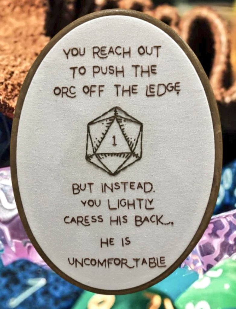
For a moment I was impressed at the stitchery but then I realized it wasn't real.
I'm also unconvinced it's real. I'd like to see the back. Also, some of the stitches look like they might curve. Real individual stitches don't curve. It might be that there are many smaller stitches giving the illusion of a curve, but I can't tell at this resolution.
Like, I don't think it's AI, just photoshopped. I have an embroidery decorative frame very similar to this one, and the back of the frame shows through the front a tad, just like in this image. (at a guess, it's the Anchor 11.5" Faux Wood Oval Embroidery Hoop & Frame. I have the 7.5" in hand and the proportions on this image are wrong for that--the wood of the frame looks too narrow.)
Is it not? Damn I wanted to praise the font and keming.
I like the font and kerning too.
But each individual letter is so exactly the same throughout, it is an "embroidery" font, not hand embroidery.
Hard to tell for sure bc the picture quality isn't great, but for example all the e's look pretty different, and the 2 g's look extremely different.
Check the o s, how they are all a little thicker than most of the letters, even though it's a simple letter. I hope I am wrong and they just have an unusual style and a very consistent hand.