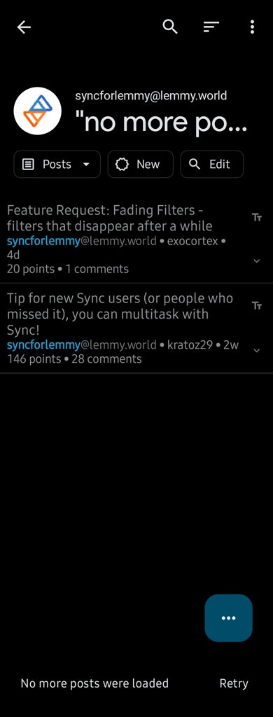
You can swipe it away
Sync for Lemmy
👀
Welcome to Sync for Lemmy!

Welcome to the official Sync for Lemmy community.
The rules for posting and commenting, besides the rules defined here for lemmy.world, are as follows:
Community Rules
1- No advertising or spam.
All types of advertising and spam are restricted in this community.
Community Credits
Artwork and community banner by: @MargotRobbie@lemmy.world
I absolutely cannot sir.
Please forgive the garbage quality
On my device the video has to be full screen to see the bottom and looks awful. On desktop it's fine.
Try slowly left to right from the left hand side
Unfortunately same result no matter where I start or how I do it
Desktop version shows it better.
Here is an alternative Piped link(s): https://piped.video/shorts/4mcpVLyrsow?feature=share
Piped is a privacy-respecting open-source alternative frontend to YouTube.
I'm open-source, check me out at GitHub.
That doesn't seem to work for me, either. Not with the left-drawer nav on, at least.. It seems like it worked without the left-drawer nav, though.
That was a good idea. I wonder if swipe to return is messing with triggering the dismiss gesture on such a narrow screen.
Edit: I'm still using left drawer navigation as I don't get along with bottom navigation bars. I cant swipe-away on this layout but I'm still happy with the app.
Thanks for your attention to my issue.
