this post was submitted on 01 Dec 2024
221 points (97.8% liked)
Map Enthusiasts
4175 readers
45 users here now
For the map enthused!
Rules:
-
post relevant content: interesting, informative, and/or pretty maps
-
be nice
founded 2 years ago
MODERATORS
you are viewing a single comment's thread
view the rest of the comments
view the rest of the comments

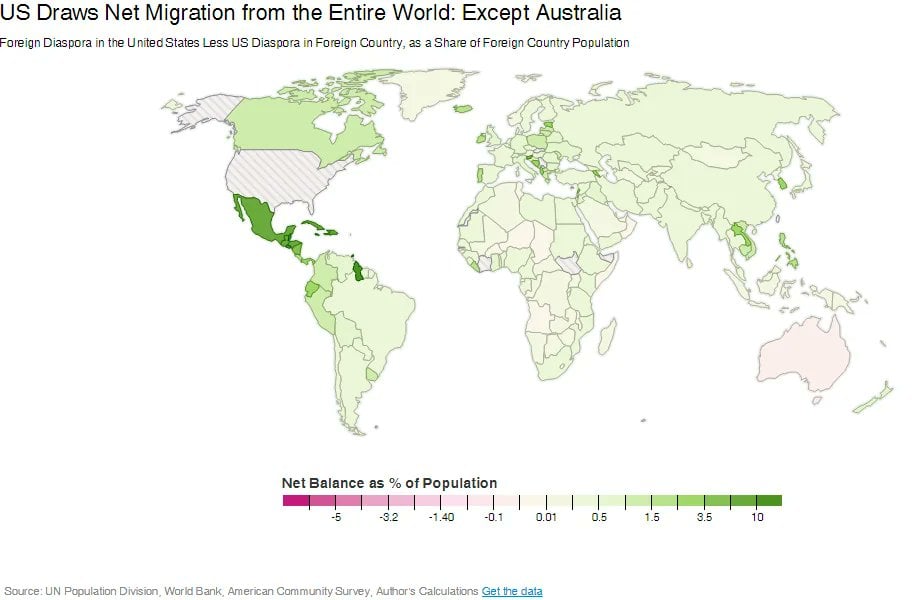
Yes, exactly, hence "per all time, that are still alive" because it's measuring the current number of American-born residents of each country, compared to the residents from said country in America.
As of what year?
Edit: id also like to point out there are diaspora maps for time frames, so just posting a map with that word is as best trying to misleading or make a statement. Otherwise, that information would be freely available. That's how data works.
That's an entirely different thing than "per unit of time". It's a valid question, turns out there isn't an answer, but some very basic searching linked me to the original map as released: http://cf.datawrapper.de/dduui/2/
To your edit, sure, there are diaspora maps for timeframes. Those are called immigration/emigration maps, because the acts of which grow or shrink a diaspora.
To be fair, I originally did say per what and when. So the when has always been an unanswered question. I've not changed my original question at all, because the original image doesn't answer them
He’s asking a valid question. There are no time references anywhere on the chart. Surely the numbers change over time, so knowing when the map was created is perfectly relevant.