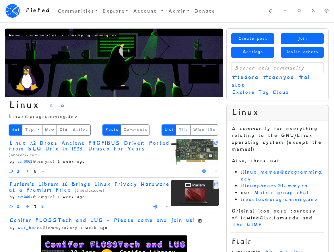
Go to https://piefed.social/user/settings and choose 'OpenDyslexia' in the Font setting, halfway down the form.
This font looks odd to me but I'm told that it really helps some people. If you're one of those people, please let me know if you have any preferences around letter spacing or line height, etc.
Edit: PieFed also has Atkinson Hyperledgible
Boom! https://danielbritton.info/dyslexia/
Neat demo, but:
No thanks
Yeah, I noticed that; the author should really have changed that by now. 😠
Still thanks for sharing as it’s cool visualisation, especially if you already have dyslexia: completely unreadable!
LMAO. I read the whole first few paragraphs thinking "this doesn't feel different" only to realize it's not in the font.
Hmm, clicking that link triggered my anti-virus software. Do you have any other source?
Just a guess, but if you're using something like uBlock, you have something in place that blocks newer top level domains (
.infoin this case). That doesn't mean the site is a problem, just that its TLD has a higher percentage of untrustworthy sites.Here's the first article that popped up about the font: https://www.sciencealert.com/new-font-aims-to-help-people-understand-what-it-s-like-to-have-dyslexia
That ~~wasnt~~ bad ~~at~~ all
This may be stupid of me to ask but did you scroll down? I thought the same thing, at first, before realizing the initial text was not, in fact, the text that was supposed to be worse.
Haha, my god. No i did not