this post was submitted on 26 Oct 2023
0 points (50.0% liked)
Soccer (Closing)
157 readers
1 users here now
This community is being retired in favor of !football@soccer.forum.
founded 3 years ago
MODERATORS
you are viewing a single comment's thread
view the rest of the comments
view the rest of the comments
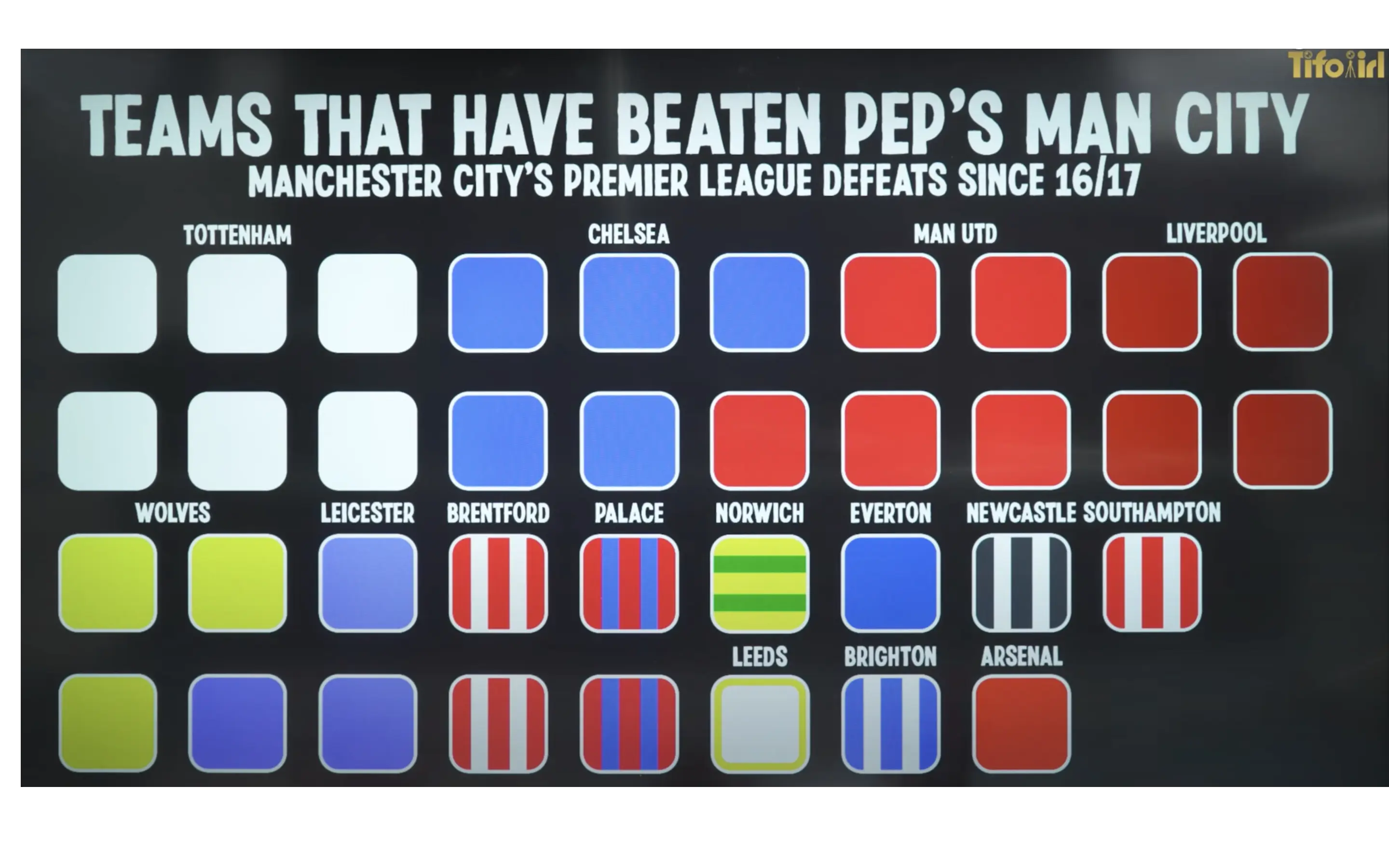
I agree, they've opted for a tighter grid instead of more clarity. Yes you can figure it out but the point of infographics is to make data more accessible not convolute it for the sake of a more structured design.
I wonder if they'd gone for a single column, vertical style it'd be a lot easier to decipher!