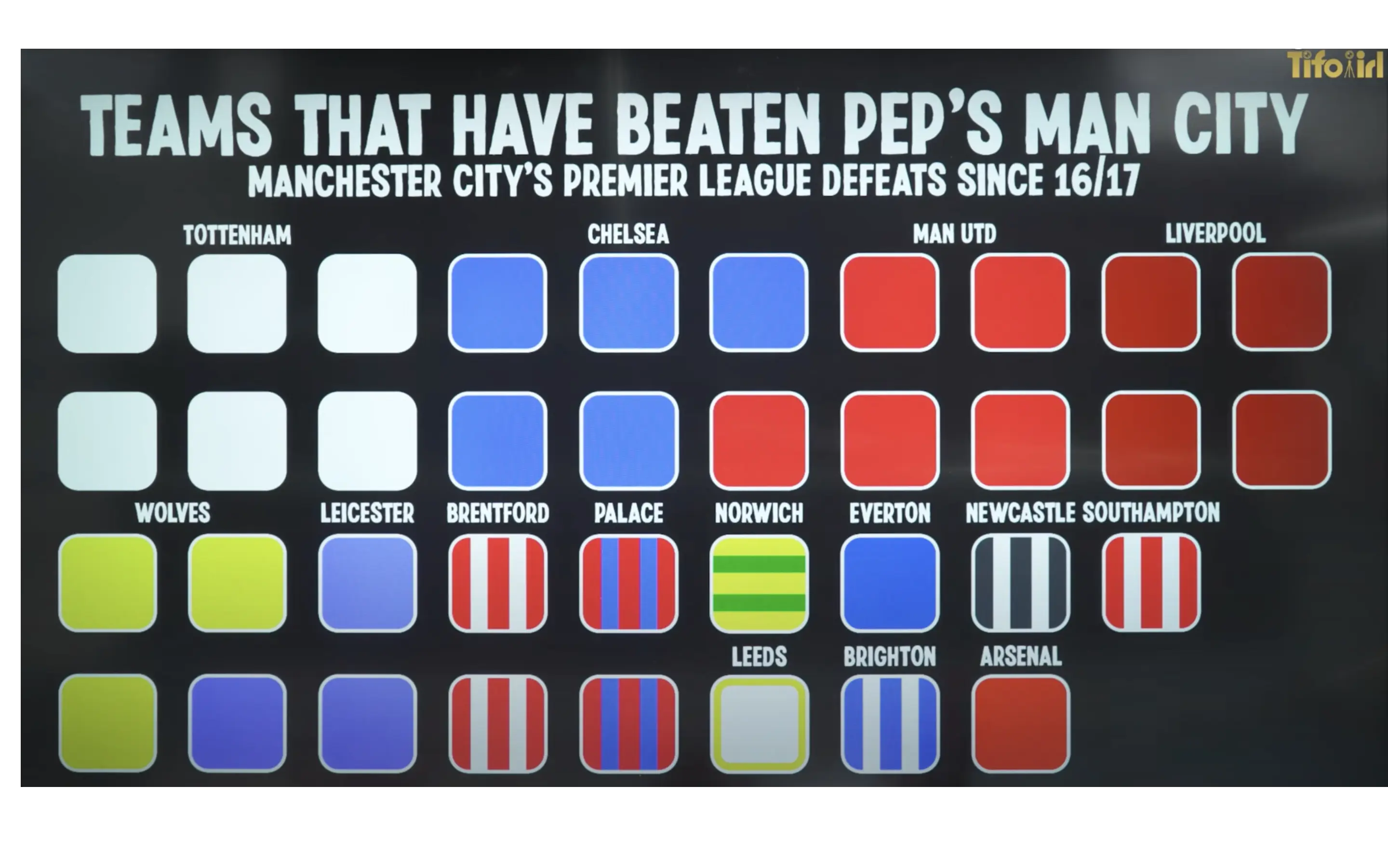
Palace > Arsenal confirmed
Soccer (Closing)
This community is being retired in favor of !football@soccer.forum.
Ole hilariously had a pretty good record against Pep IIRC
Pep desperately trying to outwit Ole while Ole were just going on good wibes
You can't make a plan to counter an opponent's tactics when even they don't know what they're going to do.
Love when people say Ole’s tactics were simply “vibes” lmao
Who was the Wolves defender that scored with his hand against City? Boly?
that sounds right
I am so glad we are finally here
Wonder if they could make this any more confusing.
Spurs 6, Chelsea 5, utd 5, Liverpool 4, Wolves 3, Leicester 3, Brentford 2, Palace 2,
What's confusing about it? You count the amount of same coloured squares below the team name and you get the number of times Pep has lost to that team
Just seems the most convoluted way of doing it.
I'm sure we've beaten Pep's side 4 times which is why I was confused.
could jumble them all up, and colour them with slightly different shades of brown
I agree, they've opted for a tighter grid instead of more clarity. Yes you can figure it out but the point of infographics is to make data more accessible not convolute it for the sake of a more structured design.
I wonder if they'd gone for a single column, vertical style it'd be a lot easier to decipher!
Only one beat him 4-0
Haha. I remember that game. You probably had like 4 shot on target too. Bravo days
That man couldn't save a Word document
Look how it all changes because 2014/15 Claudio Bravo was playing like he was possessed. He was soooo good that I'd throw my child from rooftop of burning building if that Bravo would be there to catch it.
All I remember from that game is Ademola Lookman and Claudio Bravo.
Only 37 defeats??
good on us i suppose
I'm just happy we're on the list :')
We use numbers for a reason. What a shit of displaying the date. Fuck you if you're colour blind
Doherty turning into prime Cafu was one of these L’s.
I think people failed to see how impressive Brentford has been against Pep’s City. They only got promoted in 21/22 season. That’s 2 whole season for 2 wins, while Spurs had 6 wins in 7 seasons.
Brentford doesnt even have a team as expensive as 2 Spurs players. They are doing so well
The view by manager was more interesting imo
The format hurts to look at
since 2016? why that's just... last year
I’ve never seen an uglier infograph
Although not on this list because it was 2 draws, I love the fact that Pep has never beaten Boro in the premier league!
Palace had a really good run there with wins and draws for a while a couple years back. The Townsend volley in the 3-2 win really brings a smile to my face.
Classic example of today's dumbdown UX shit. A simple bar graph would had done t trick...but hey we need t curved squares with different shades of the same colour...
I've seen this kind of graph for United as well.
It was in a museum, with a little plate next to it that said:
"Georges Seurat, Un dimanche après-midi à l’Île de la Grande Jatte, 1884-86".
Well and truly massive.
This is probably the worst way imaginable to show such data, it's actually creatively bad
I fucking love Stuart Dallas.
