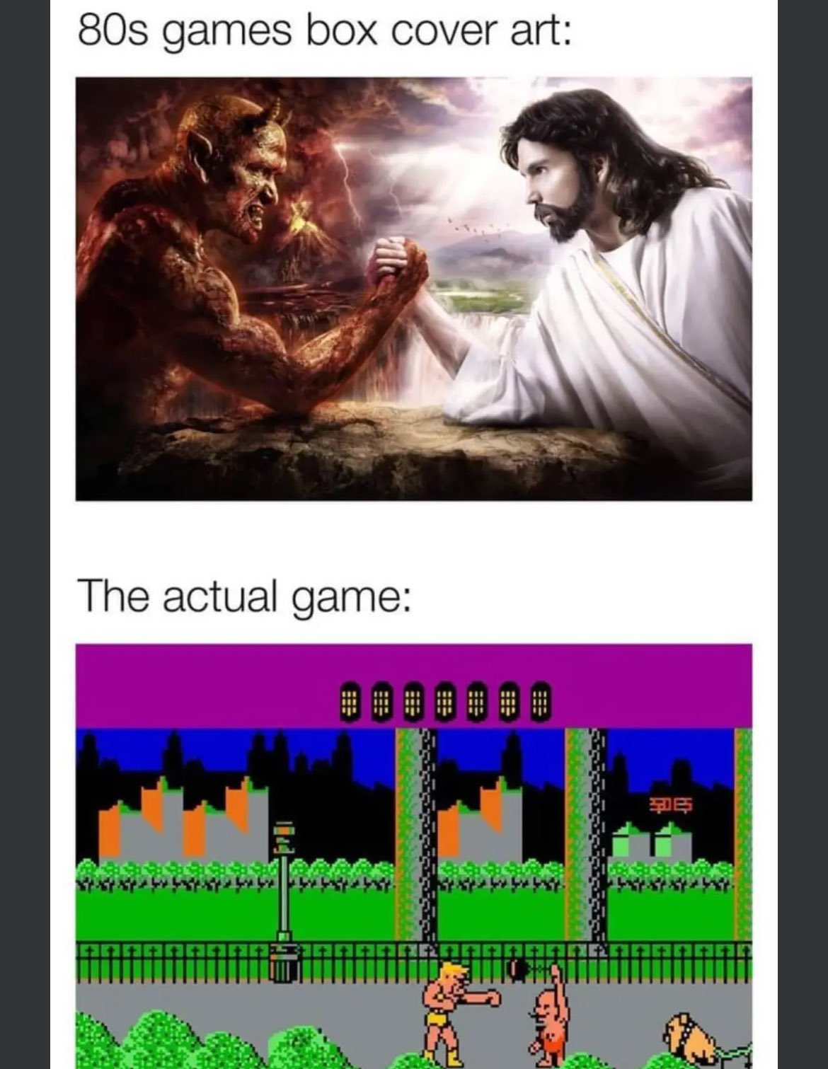
It's the same with lots of indie games now. Oh, and mobile ones too
RetroGaming
Vintage gaming community.
Rules:
- Be kind.
- No spam or soliciting for money.
- No racism or other bigotry allowed.
- Obviously nothing illegal.
If you see these please report them.
Back in the day, deep down you knew what you were really getting. I'm a little annoyed these days when indie games use marketing visuals that look like they could be in-game for a modern title and then it's all pixel art style. I get that you don't make a pixel art poster, but in that case, go all-in on an art cover don't let it be mistaken for game graphics.
Bro, that stupid game with the guys that shoot barrels to get more fighters/better weapons looked fun. The actual game is a shitty base builder with timed progression, of course you can pay to get past the time locks. Fuck that company and every "influencer" that takes their dirty money.
Back when XBLA got going there were so many games with anime character art that ended up being meh side-scrolling platformers with 8-bit pixel graphics. Looking at the Nintendo eShop... not much has changed. 😄
As someone who lived through that era, let me tell you, the gameplay graphics were never a disappointment. In your mind they looked as good as graphics today. The only thing I can remember being disappointed about was the Nintendo Powerglove. Man, what a collosal, non-working, over hyped advertising lies, piece of shit that thing was!
Nah there were definitely games that had disappointing graphics relative to what I was expecting lol
Although it's true, we generally were more forgiving about graphics back then than we are these days.
The Wizard lied to me for 2 hours about that useless piece of plastic.
Dude, the guy who introduced it in the movie straight up said "it's so bad!"
But if you would have saved it until today you could resell it foe a whole $25 more (of course accounting for inflation it’s actually $105 less)
…
Wait is that true? Did a rare Nintendo product depreciate in value????
It was a mattel product
ahem....
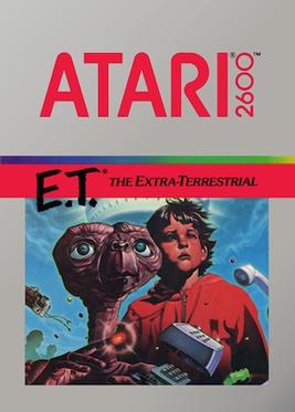
That's the masterpiece that helped kick off the new age of gaming!
I remember renting Phalanx just because of the box. like "why's this old man playing the banjo?" then you look at the back and it's a friggin space shooter. I had to rent it.
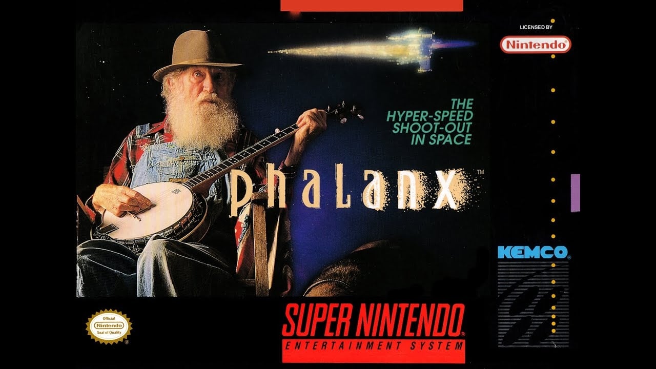
The agency that created the box art created it for the exact reason you picked it up.
yeah after posting this I read the story on Destructoid about it. It worked. it was a meh game but the only reason I wanted to play it was because of that box.
I was always so disappointed in the 90s to see 'realistic' looking graphics and then you play the game and realize it was just a point and click game
Everyone always praised Myst for its great graphics. I always thought it was cheating because it was pre-rendered.
Even being prerendered, it was an intensely impressive game for 1993.
And it's not like they didn't have plenty of problems to solve.
Here's an interesting interview with founder Rand Miller about developing Myst and how they were barely able to make it work due to the limitations of CD drives.
Lots of the best games were prerendered! Donkey Kong Country, Fallout, Jagged Alliance 2, Duke 3D, the Pro Pinball games, just to name a few.
I do have a soft spot for prerendered graphics.
Sure it was pre-rendered, but it was still impressive to see PCs do that at the time because of the sheer amount of storage it took. Myst basically required a CD-ROM drive because the game is basically made of pictures, PCM audio and video. There's an astonishing amount of video in that game from the early 90's. It was another symptom of CDs having an astonishing amount of capacity for their era. Myst couldn't exist on floppy disk.
It is pretty cool to see what they've recently done to Riven. They really brought it to life in Unreal Engine.
there were engineering competitions in the late nineties for realtime rendered games. they tended to look like vetrex games.
Speaking for myself but in 1995 or whatever I didn’t even know what the term rendered was. Game looked cool but I liked Tex Murphy Under a Killing Moon for state of the art graphics lol
Final Fantasy. Flowing dramatic artwork. 18 pixels of character (hyperbole, idk the actual pixel number.)
The character sprites were 16x24 in combat, so a whole 384 pixels to work with!
A 386 could handle that easily and still have two pixels left.
Gonna make good use of those 33Mhz!
Sometimes I forget that CPU clock speeds were talked about in Mhz instead of Ghz.
I decided to play Crystal Warriors recently because of the awesome cover art. DUDE I WAS NOT DISAPPOINTED. That game rules!
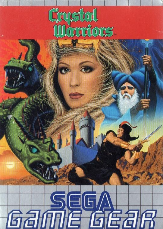
I'm reading this game's wikipedia page and it sounds very fun. What a shame it's stuck on the game gear and the now nonexistant 3ds eshop. I hope Sega does another re-release. Not that it matters to me 🏴☠️.
I can't research it at the moment, but I want to say that was a common thing in the pre-NES days, and I think Nintendo required actual gameplay graphics to be shown on the box because of that.
Could be off on the specifics, but I do vaguely recall those kinds of non-representative box art having some controversy.
Mega Man would like a word.
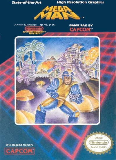
Just look at that sexy bastard.
Maybe they got a pass if the in-game graphics were better than the box art? 😆
What do you mean? This is the greatest art in the history of art. It makes me FEEL something. Those in game graphics don't make me feel at all.
That feeling is called nausea
Mind you, that was only American artwork. Original Japanese:

Nintendo of America often used pixel art for their own box art early on in the NES era. It was similar to the in game graphics, but usually more detailed. See Metroid’s original artwork. If there was a requirement for third parties, perhaps it could be met by simply including screenshots on the back.
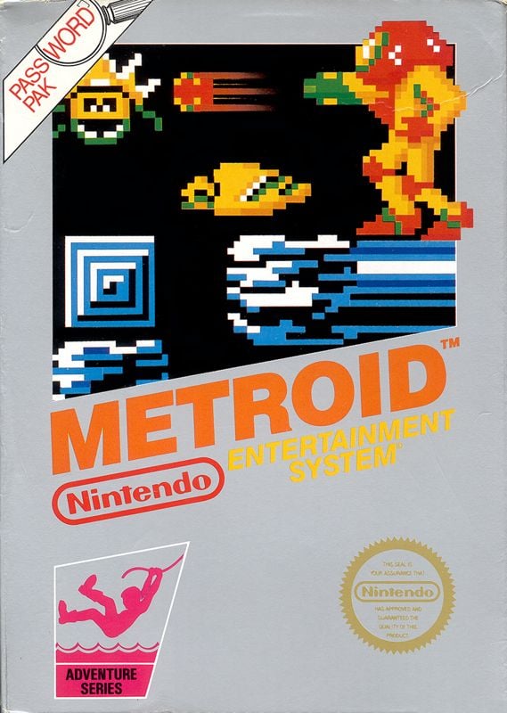
the back usually showed gameplay shots.
Yes, where they put the superior Amiga screenshots on the back of your ZX Spectrum game
Lol how was that allowed? It's a complete different version.
If you think it's an unregulated mess now, take a look at the home computer scene in the mid-80s. Absolute wild west, dude.
Holy crap that's Bad Street Brawler. I have this game still. It's straight up the worst game I've ever played.
Uh...bad street brawler was amazing
I had Bad Street Brawler for the NES and it's so bad, it's funny. Even back in the day.... fighting midgets, dogs, and circus strongmen, trying to get to the dumpster at the end of the level, and with 2-player coop to boot
I 💯 went through this disappointment. I used to also love looking at a game's concept art because they always looked so much cooler and atmospheric than the game. I remember the inflection point clearly. I was playing Mass Effect 3 and walking around the citadel wards/docks, with it's beautifully detailed textures, evocative colours, and painterly lightshafts, feeling absolutely enthralled, and thinking "Holy shit, they've finally done it, the gameplay looks better than the box/concept art."
I'm so glad I finally got around to playing the ME series. Such a memorable trilogy of games
Honestly graphics aren't really that important compared to the gameplay. Games such as those in the UFO 50 collection are a really good example of that. Also if you actually want a quality god vs satan game with old school graphics then I highly recommend Grimstone.
My games were all pirated. Covers had a handwritten list of all games on the cassette (and later CD). The first legit game I've ever seen was Mortal Kombat Trilogy and I remember being taken aback by the waste of using a full CD for a single game (iirc the game used just 30 MB of space on that CD).
