Is there a single improvement to any uniforms except the new Kings set which I really like? Philly home and away were some of the cleanest in the NBA and now they muddied them up with the cartoonish drop shadows, super disappointing
this post was submitted on 19 Oct 2023
1 points (100.0% liked)
NBA - Main
38 readers
3 users here now
Game analysis, highlights and everything else that is happening in the NBA.
founded 2 years ago
MODERATORS
Wolves and Suns look dope IMO
Yeah Wolves throwback is fantastic, suns I've been undecided about since they were unveiled. I think I need to see them on the court. The home whites are particularly iffy for me, the white SUNS lettering with a white ball on a white background kind of washes out IMO, there's just not enough contrast
I like the Hornets one
Definitely getting the classic magic jersey this season, been way too long since we used it. It’s one of the best in the NBA imo, not sure why we ever went full corpo
Even in jersey reveal, Chicago Bulls is Washington Wizard’s father.
The Detroit jerseys don't even look like NBA jerseys lmao
They do a lot of things wrong so I'm not surprised
They did bring back the teal jerseys for a bit, they should just stick with those
Well, this is underwhelming...
And the best ones are just throwbacks.
Is this the first time we're seeing what the trophy for the In Season Tournament looks like?
The Houston Clippers
Also, the Los Angeles Wizards.
This could work for Westbrook
I need to see it with the number. Our city edition isn’t awful, but it isn’t great either. The gold trim color on the sides is weird. Honestly with how adventurous Celtics jerseys usually are, this is pretty par for the course. Worse than last year though
C+ / B-
load more comments
(1 replies)
LMAO, the Mavs are really bringing the trash bag unis back from the grave. The one uni that pretty much is universally despised by every single person ever
I'd still take them over about half of these city jerseys
Wtf! The Pacers one is so bad
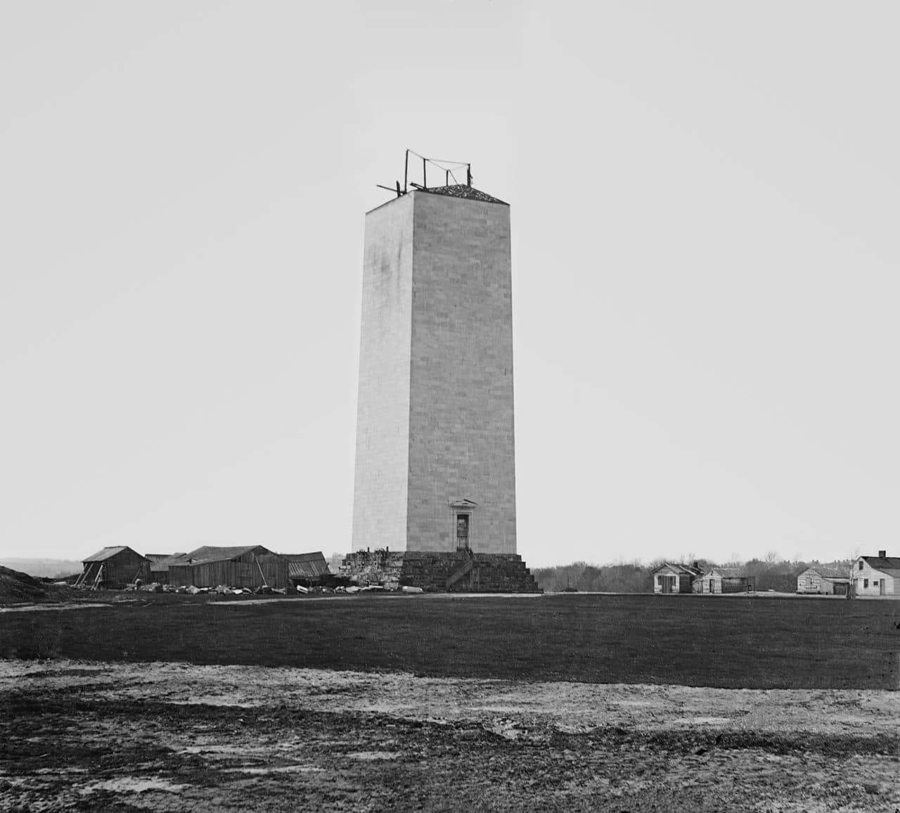
Lowkey worried that we haven't seen our new jerseys yet. Someone said the change to the Washington monument looks like a reference to the Zero Milestone, which is a weird choice.
Is that what it's supposed to be? Not an obelisk, for sure.
Looks more like the half finished Washington monument but it still seems random
Oh wow, really embracing the rebuild lol
NBA/Nike needs to scrap the city edition jerseys. There is not enough creativity or man power to come up with good looking jerseys for 30 teams every single year. Not to mention the brand recognition lost when half the teams are wearing colors that don't match the franchises' primary colors. I struggle to imagine that the return on these in sales is worth what the designers and manufacturers are costing for these piece of shit jerseys.
I think some are good. But we don’t need new ones every year.
Like maybe rotate 10 teams every 3 years or something.
load more comments
(1 replies)
I struggle to imagine that the return on these in sales is worth what the designers and manufacturers are costing for these piece of shit jerseys.
The designers probably aren't paid anything that crazy, plus Nike got designers on staff already. The cost of manufacturing is also probably negligible for them too. They wouldn't keep doing it if it wasn't profitable.
Nike just gets freelance work of Fiverr and calls it a day. It's the only explanation for some of these.
Nah then they'd have to pay someone else to do it. They just have whoever's on staff already throw something together in 5 minutes between projects they actually care about.
All of these literally look like 2K pro-am jerseys. This community should be able to generate enough noise on social media and tell nike to politely fuck off with this nonsense.
load more comments
(1 replies)
I think we found Kyle Kuzma's burner account.
Magic raptors suns jersey w’s
I also really like the spurs court
That Minny uniform looks amazing
I don't know why, but the Pacers' one is growing on me ¯\_(ツ)_/¯
Same
The Celtics’ 2023-24 City Edition uniforms, which leaked this week and have subsequently been confirmed by the team, are seemingly a nod to Dr. James Naismith, who invented basketball in Springfield, Massachusetts, in 1981.
wow, basketball has only been around since the 80s? what was bill russell playing?
I was confused by that too
Man the Knicks titles from the 70's are fake
I like the Suns, Warriors, Sixers, Hornets and Magic going old school. A whole lotta ugly outside of those teams for me.
Dang they left out the new Blazers’ court design
I fucking hate our city edition
who the fuck approved that shit?
Yup 0 effort.
load more comments
(1 replies)
those Heat jerseys 🤣🤣🤣 (i can legally laugh since the Lakers one is vomit-inducing as well 😔)
it's painfully bad lol not even just the "heat culture" being spelled out, what is that weird ass seam at the neck? Like they tried to make the jersey double as business casual if you throw on a pullover 😂
It’s actually wild how bad these jerseys are on a yearly basis.
Literally just give people the retro Mitchell and ness uniforms and it will go 100x better than these
Wolves went extra hard to redeem themselves from last years
That City edition for you guys is dope as fuck imo. And I've always liked the simplicity of those Wolves throwbacks, the white ones were clean as hell imo.
almost everyone should be in pre 2k unis honestly
They took away my beautiful blue and green jerseys and replaced it with this basic trash?
Most of those are ugly.
Like the Magic throwback to the early 2000s one. And the T-Wolves water jersey looks good.
Also like the Suns/Jazz with their partial logos on them (Sun & Mountains), but those aren't City jerseys that are mostly bad.
Hopefully the Jazz just alternate those two purple ones all season and pretend the other three don't exist.
view more: next ›