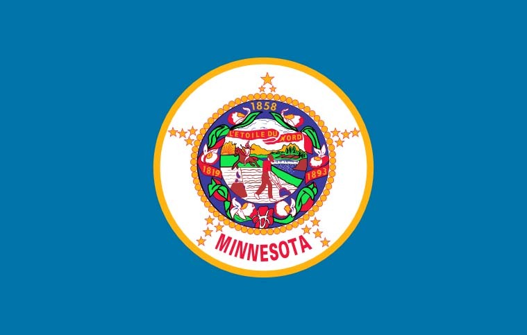
Too bad they didn't go with the Polaris Tri-color. I agree with Grey that it was the best of the color variations.
this post was submitted on 19 Dec 2023
470 points (97.8% liked)
News
38247 readers
1744 users here now
Welcome to the News community!
Rules:
1. Be civil
Attack the argument, not the person. No racism/sexism/bigotry. Good faith argumentation only. This includes accusing another user of being a bot or paid actor. Trolling is uncivil and is grounds for removal and/or a community ban. Do not respond to rule-breaking content; report it and move on.
2. All posts should contain a source (url) that is as reliable and unbiased as possible and must only contain one link.
Obvious biased sources will be removed at the mods’ discretion. Supporting links can be added in comments or posted separately but not to the post body. Sources may be checked for reliability using Wikipedia, MBFC, AdFontes, GroundNews, etc.
3. No bots, spam or self-promotion.
Only approved bots, which follow the guidelines for bots set by the instance, are allowed.
4. Post titles should be the same as the article used as source. Clickbait titles may be removed.
Posts which titles don’t match the source may be removed. If the site changed their headline, we may ask you to update the post title. Clickbait titles use hyperbolic language and do not accurately describe the article content. When necessary, post titles may be edited, clearly marked with [brackets], but may never be used to editorialize or comment on the content.
5. Only recent news is allowed.
Posts must be news from the most recent 30 days.
6. All posts must be news articles.
No opinion pieces, Listicles, editorials, videos, blogs, press releases, or celebrity gossip will be allowed. All posts will be judged on a case-by-case basis. Mods may use discretion to pre-approve videos or press releases from highly credible sources that provide unique, newsworthy content not available or possible in another format.
7. No duplicate posts.
If an article has already been posted, it will be removed. Different articles reporting on the same subject are permitted. If the post that matches your post is very old, we refer you to rule 5.
8. Misinformation is prohibited.
Misinformation / propaganda is strictly prohibited. Any comment or post containing or linking to misinformation will be removed. If you feel that your post has been removed in error, credible sources must be provided.
9. No link shorteners or news aggregators.
All posts must link to original article sources. You may include archival links in the post description. News aggregators such as Yahoo, Google, Hacker News, etc. should be avoided in favor of the original source link. Newswire services such as AP, Reuters, or AFP, are frequently republished and may be shared from other credible sources.
10. Don't copy entire article in your post body
For copyright reasons, you are not allowed to copy an entire article into your post body. This is an instance wide rule, that is strictly enforced in this community.
founded 3 years ago
MODERATORS
I liked this choice. The tri-color seemed a little busy to me.
I agree. I do like the tri color and would have been happy with it, but there’s a quote from whom I cannot remember that essentially is “flag design is finding the perfect flag and then dialing it down a notch”. And to that end, I think it succeeds wonderfully.
It’s modern but classic. Detailed but not busy. Inclusive but not all-encompassing. It’s pretty amazing.
I am glad they changed the star design; I think the new one is much better.
My only gripe with the alterations of the submitted design is the star shape change.
I loved the big points in the cardinal directions with smaller points in between. I dislike this eight-pointed star.
load more comments
(4 replies)
Tricolor was better. 120%.
I would have sworn my eternal allegiance to the Polaris Tri-Color. This one is nice, especially for a state flag, but not inspiring.
I recently finished watching that video and NGL the tricolor with less toned colors looked pretty beautiful to me.
I like that they went with the simplified "K" shape for Minnesota (the reverse triangle is really clever visually) but I did also like the more colorful version better. Just a little too plain now for me.
I don't even know what Minnesota's flag looked like.
Uh, no one is going to miss that.
Don't worry, Republican legislators are already in frothing rage about the change. I'm sure it has nothing to do with them wanting to keep the problematic imagery in the current one of native Americans being driven off their land. /s
Also they're spreading some conspiracy theory the new flag is supposed to look like the flag of Somalia or something and that this is a prelude to Sharia law being imposed. I wish I was joking. Yeah, because it has blue colors and a star in it, it must be an homage to Somalia, couldn't have anything to do with being the "land of 10,000 lakes" and "the north star state." Or even the old flag, which get this, is blue with a big star in it.
I also liked the version with the stripes better, but this is very nice too, and anything is better than the atrocious current one. The new seal with the loon is very nice too.
Other states that just lazily slapped their seals on to a blue background take note and get to fixing them up please.
New seal:

Libtard snowflakes don't even know what a seal looks like. It sure ain't looks like a bird, I tell ya
But loons are half bird/half seal with bitchin' red eyes.
And these morons gave it white eyes. Will the insanity never cease?
I have fantastic news for you, looks like the one I posted was revised slightly before approval. It's got the red eye now!
I was 100% joking, but that’s hilarious that they changed it.
I agree it's much better this way. Laser loon lives on.
load more comments
(1 replies)
load more comments
(5 replies)
Racism aside, it's like an ugly Christmas sweater in flag form.
I love it when someone can verbalize my feelings perfectly.
I cant make out the racism. Is that supposed to be a slave? It looks like a taco bell employee the way hes dressed
That is a terrible flag even without the racism. A good flag should be clearly identifiable as an emoji or at least a stamp.
It's worse than the original design with the white/green/blue tri-colour on the right.
But still a big improvement.
I like how easy on the eyes it is.
It's actually pleasant to look at while not demanding your attention.
Solid flag.
CPG Grey will be so excited.
This is the only reason I clicked on this post as I reckonized this flag from his video.
The new flag is badass!
I just looked it up out of curiosity, and Minnesota's old flag is boring and generic AF. It was a member of the "state seal on blue" club.
load more comments
(2 replies)
We'll be trying to get our hands on a nice flag with the original design#1953 on it to fly outside our house. This one is fine I guess, but it stings with what could have been.
What the hell happened to the star‽ They took away its twinkley starriness. Now it just looks like a blurry circle
load more comments
(1 replies)
Anything is better than the seal on a blue sheet
Yeah, flags like those are just generally bad.
Cool flag. I like the solid light blue over the stripes that were an option, K.I.S.S..
Feel like with that simplified they could have done something with color a little more interesting than the dark blue to really emphasize the shape of that dark blue region but if you can't give this a 10/10 your standards are too high.
I liked the tri-color design, but this one is good too, like you said simplicity is best. The dark blue in the K shape is shaped like the state, so the solid color fits.
This is a great choice. That flag is probably now the best one in the Union.
In my opinion Mew Mexico and Arizona are both better. I hope this encourages more states that are just "blue field with state seal" to make better flags. New York really needs help 😅
load more comments
(7 replies)
load more comments
(1 replies)
The new one suffers from aluminimalism whereas the old one looks like something my mom would stick to the fridge with magnets to show how proud she was of my work in fifth grade that I spent all Thanksgiving afternoon working on by myself.
As a Texan, I approve of this design.
I like it fine, and I bet you could incorporate those design elements into a lot of cool merch, which is a nice rule-of-thumb for useful flags.
B2 - Blue, white, green, with the same star - should have won, imo. But I don't live in the state, so my opinion is irrelevant.
Can Florida please do this too!? 😔
But definitely don't open it up to public consultation. Because Florida
view more: next ›