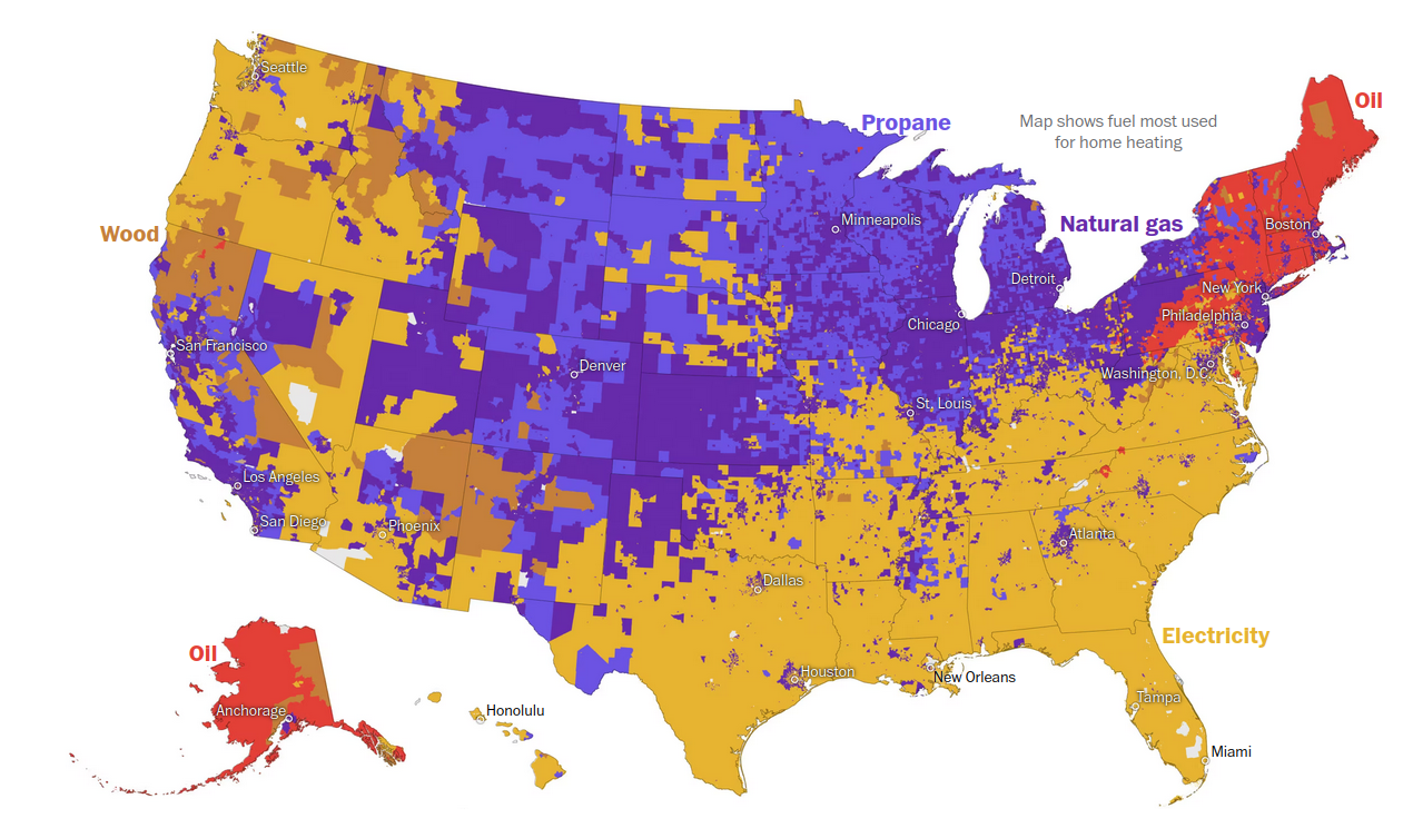
How do you heat your home?
Honolulu.
Seriously this map (top especially) is... C- at best; I know elementary teachers that would fail this on the spot. Why not just list the colors in a 'label' box? Why are there two shades of purple? What about yellow and dried-poo yellow-brown? (if you argue 'it's the color they appear', electricity isn't yellow and oil isn't red...) Why is there a text blurb in essentially 12pt font hiding in the great lakes/canada instead of double+ the size and at the top, centered? Why are some state capitals on the map - and in the worst color contrast possible (see: why are there two purple colors...). Also, why are they in like 10pt font? Why is oil listed twice?
For a display of just 5 items, this is pretty awful.

